











































A landing page video earns its place when it does one job for one visitor: explain the product in the visitor’s words, show it working, or prove it with a customer. For a complex SaaS product, put a short explainer or product-in-use video above the fold, a longer walkthrough for evaluators further down, and a customer proof video near the call to action. Use a poster image, lazy-load anything below the fold, caption everything, and never rely on sound or autoplay alone. Measure plays, watch-through and assisted conversions per page, not an average across the site.
The best landing page video for a SaaS product does one job: it explains the product in the visitor’s own terms, shows it working, or proves it with a customer, and it sits where that job matters most on the page. For a complex product, that usually means a short explainer or product-in-use video near the top, a longer walkthrough for evaluators lower down, and a customer proof video close to the call to action. This guide covers what to show, where to place it, how to handle autoplay, captions and page speed, and how to measure whether it is working.
A note on scope. We have written about what explainer videos cost, how to hire a SaaS explainer video agency, how to brief a product demo video and how to make a technical explainer for complex products. Those posts are about making the video. This one is about the page: which video belongs on which landing page, where it goes, and how to implement and measure it so it helps conversion instead of slowing the page down. The two topics meet in the brief, which we cover near the end.
- The short answer
- What the video is for on each page
- What to show: five video types
- Where to place it
- Hero video: autoplay, poster and sound
- Length and structure
- Page speed and hosting
- Captions and accessibility
- Measuring video conversion rate
- A brief your video team can use
- Seven mistakes to avoid
- How this played out
- FAQ
- Verdict
The short answer
A landing page video should carry one idea for one visitor and one decision. If the visitor is a founder or marketing lead who is deciding whether your product is worth a call, the video has to make the product understandable fast, then hand them a clear next step. If the visitor is a technical evaluator, the video has to show the product doing real work. If the visitor is a buyer who has been burned before, the video has to bring a customer into the room.
Everything else on this page is implementation: which placement, which length, how to load it without hurting the page, how to make it accessible, and how to measure it. Teams that skip the first decision, what job the video does, usually end up with a polished brand film that sits above the fold, gets skipped and tells the visitor nothing they could not read in the headline.
What the video is for on each page
Landing pages are not one thing. A homepage, a product page, a paid-campaign landing page and a demo-request page serve visitors at different stages, so the same video will not work on all of them. Start from the page’s job, then choose the video.
Notice that the homepage and the campaign page are different problems. The homepage video can be more explanatory because the visitor is exploring. A campaign page should keep a tight focus on the promise that brought the visitor there, which often means a shorter video, or no video above the fold at all if the page already makes the offer clear.
💡 Pro Tip: Write the visitor’s question at the top of the brief before anyone opens an editor. “What does this product actually do?” and “Will it work in our stack?” call for different videos.
What to show: five video types for SaaS landing pages
Most effective landing page video for complex software falls into five types. You rarely need all five on one page, but you will probably need three or four across your site.
1. The explainer: promise and mechanism
The explainer opens with the visitor’s problem in their words, then shows the mechanism that solves it. For AI, data and deep-tech products the mechanism is the point, because buyers cannot picture what happens inside the product. Motion graphics, diagrams and annotated screen capture earn their cost here. See our notes on the choice in the post on live action versus animation for SaaS explainers, and the script structure in our explainer video script template for SaaS.
2. The product-in-use clip
A short, silent-friendly clip of the real interface doing one real task. It works as a looping hero background or as a click-to-play preview. The craft is in the edit: cursor movement, zooms on the part that matters, and annotations that tell the viewer where to look. A raw screen recording without that polish tends to read as a tutorial rather than a reason to book a call.
3. The evaluator walkthrough
A longer video for the visitor who has already decided to look closely. It lives below the fold or on a dedicated page and goes through a workflow end to end. Add chapter markers so a visitor can jump to the part that matters to them. This is the video your sales team will send in follow-up emails, so it earns more than its placement suggests.
4. The customer proof video
One customer, one situation, one outcome, in the customer’s voice. This is the video that answers “does this work for companies like ours?” We cover the format in depth in our guide to the B2B video case study. On a landing page, a short cut of that story sits well near the call to action, where doubt peaks.
5. The objection clip
Thirty to ninety seconds on one worry, such as security, onboarding effort or integration with a specific tool. Place it next to the section where the worry appears: pricing, security or a feature page. A clip that answers a real objection is often more useful than a general brand film.
The “typical length” column is deliberately qualitative. Length should follow the job and the audience, not a number from a blog post. We say more on that in the length section.
Where to place it
Placement is where most landing page video decisions go wrong. Teams treat the hero as the only slot and put the wrong video there. A better approach is to think in terms of the visitor’s journey down the page.
Above the fold
The above-the-fold slot has to carry the page’s main promise. A click-to-play explainer works if the headline and the poster make the video look worth clicking. A silent looping product clip works if the headline already carries the message. Do not put a long brand film here and hope people watch it. The visitor is still deciding whether the page is relevant.
Mid-page, beside the proof
The middle of the page is where evaluators look for specifics. A walkthrough or a feature-specific clip fits here, next to the copy it supports. Keep the video next to the text it explains rather than in a separate “video” section, which many visitors will skip.
Next to the call to action
Doubt peaks just before someone commits. A short customer proof video, or an objection clip, beside the demo-request form can make the difference between “I will think about it” and a booked call. The video should end by pointing to the form, not away from it.
Outside the page: where the same video should also live
A landing page video is rarely only a landing page asset. The same cut can feed sales emails, a YouTube channel, a webinar follow-up and paid retargeting. If you plan the shoot with those uses in mind, the incremental cost of each extra use is small. That is the logic behind the B2B video marketing strategy we recommend: make fewer, better source videos and cut them for each placement.
Hero video: autoplay, poster and sound
The hero is the highest-stakes decision, so it deserves its own checklist.
Autoplay: use it for silent clips only
Browsers have tightened their rules on autoplay. In Chrome, for example, the autoplay policy generally allows muted autoplay and restricts autoplay with sound, and the MDN autoplay guide describes similar behavior across browsers. Practically, a video that carries the explanation with narration cannot count on autoplaying with sound. If it autoplays, it autoplays silently, which means the message has to survive without audio.
That gives you two clean options. Either the hero is a silent, looping product-in-use clip that does not depend on sound, or the hero is a click-to-play explainer with a poster image that makes people want to press play. The awkward middle, an explainer that depends on narration but starts muted and confuses visitors, is the one to avoid.
Give people a way to pause it
Moving content that starts automatically and lasts more than five seconds is covered by the WCAG guidance on pause, stop, hide: visitors need a mechanism to pause, stop or hide it. A visible pause control on a looping hero clip is a small addition that protects accessibility and avoids annoying visitors who find movement distracting.
The poster image is a design decision
For click-to-play videos, the poster is the first thing a visitor sees, and it does most of the work of getting the click. A frame that shows the real product, a clear title that names the outcome and a visible play button gives a visitor more reason to click than a generic stock frame does. For performance reasons it also needs to be a properly sized, compressed image, which we cover below.
💡 Pro Tip: Test the hero with sound off, on mobile, on a slow connection. If it still communicates the promise, you have a hero. If it only works with perfect conditions, it is a risk.
Length and structure
Most advice on length is a single number, and most of it ignores the page. A better approach is to match length to the visitor’s intent and to build a modular set. The above-the-fold video should be short enough that someone who has just arrived can watch the whole thing. The evaluator walkthrough can be much longer because the visitor has chosen it. For the data behind how quickly viewers leave, see our notes on how long viewers wait through a video intro and video retention benchmarks by platform.
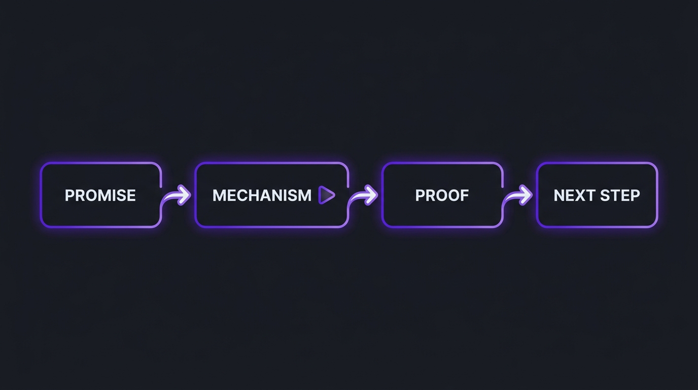
Inside any length, the structure that holds up for B2B software is the same spine as the diagram above:
- Promise. State the outcome the visitor wants in their language, in the first few seconds. No logo animation, no long preamble.
- Mechanism. Show how the product produces that outcome. This is where diagrams, motion graphics and real interface footage do the heavy lifting.
- Proof. A customer, a result you can stand behind, or a visible detail that shows you understand the buyer’s world.
- Next step. One clear action that matches the page: book a call, start a trial, read the guide. Do not offer four options.
For a complex product, resist the urge to cover every feature. The video’s job is to earn the next click, not to replace the sales call. Features that need a long explanation belong in the evaluator walkthrough, not the hero.
Page speed and hosting
A video that drags the page down loses the visitor before it plays. Two facts from Google’s web performance documentation matter here. First, the poster image or first frame of a video can be the Largest Contentful Paint element, and the documented target is an LCP of 2.5 seconds or less at the 75th percentile of page loads. Second, lazy loading video with a poster image and a restrained preload setting stops below-the-fold videos from loading before anyone scrolls to them. For a broader view, the guide to optimizing LCP walks through what delays it.
- Hero: use a lightweight poster, make it discoverable in the initial HTML and avoid loading a heavy player script before the first paint.
- Everything below the fold: lazy-load, and consider a click-to-load facade that swaps in the real player only when the visitor presses play.
- Compression: export for the web, not for the archive. Your editor should deliver a web-ready file and a poster frame, not only a master.
- Mobile: test on a real phone on a mobile connection. Desktop on office Wi-Fi hides most problems.
Choosing where the video is hosted
There are three common routes, each with trade-offs:
There is no single right answer. Pick based on what you need to measure, how much control you want over the experience and whether the same video also needs to rank on a public video platform. Whatever the route, ask your editing partner to deliver the files the route needs: captions, a poster frame, and the right aspect ratios.
If you also want the video to appear in search, Google documents how to make video pages eligible in its video search guidelines, including the page and markup basics. It is a secondary benefit for most landing pages, but it costs little once the video is on an indexable page.
Captions and accessibility
Captions do three jobs on a landing page. They make the video usable for deaf and hard-of-hearing visitors, they make it work for people watching with sound off, and they make the content readable by search engines and screen readers when paired with a transcript. The W3C’s guidance on captions is a good starting point, and our own video accessibility guide covers the WCAG and ADA side in more detail.
- Add accurate captions to every video on the page, not auto-generated text left unchecked.
- Offer a transcript for the longer videos, especially the evaluator walkthrough.
- Make sure the player is operable with a keyboard and that controls are labeled.
- Do not rely on color or sound alone to convey a key point.
Accessible video is also better video for the muted viewer. If your hero is meant to work without sound, captions or on-screen text are not an add-on; they are part of the design.
Measuring video conversion rate
“Video conversion rate” is a slippery phrase, because a video can contribute without being the last click. It helps to track a small set of signals and avoid reading too much into any one.
Be careful with the obvious comparison. Visitors who choose to watch a video are often already more interested, so a higher conversion rate among watchers does not prove the video caused it. Where traffic allows, run a controlled test of the same page with and without the video, or with two different videos, and change one variable at a time.
For a considered B2B sale, also judge the video by the quality of the conversations it produces, not only the volume of form fills. A video that filters out poor-fit visitors and sends better-informed ones to the call is doing its job, even if the headline conversion number barely moves. If you publish the video on a channel as well, our B2B YouTube benchmarks are a useful companion for judging the channel side.
A brief your video team can use
Whether you hire an agency or run production in-house, the brief decides most of the outcome. Fill in these lines before any footage is shot or any animation is scripted:
- Page and visitor. Which page, which visitor, which stage of the decision.
- One job. Explain, show, or prove. Pick one.
- The promise. The outcome in the visitor’s words, one sentence.
- The mechanism. The one thing you need the visitor to understand about how it works.
- The proof. A customer, approved result or detail that backs the promise. Only what you can stand behind.
- The next step. The single action the page wants.
- Placement and behavior. Hero or section, autoplay or click, sound on or off by default.
- Versions. Which cuts you need: long, short, silent loop, social clip, email thumbnail.
- Delivery. Captions, transcript, poster frame, web-ready files, aspect ratios.
If you are choosing a partner, our guides to hiring a SaaS explainer video agency and the best explainer video companies cover the vendor side, and our overview of video editing for product demos and explainers explains what happens in post-production.
Seven mistakes to avoid
1. Putting the brand film in the hero
A film about your values or your team is rarely what a new visitor needs. Save it for the about page and use the hero for the promise and mechanism.
2. Depending on sound for an autoplaying video
Most autoplay is muted. If your message lives in the narration, make the video click-to-play, or add captions and on-screen text that carry it.
3. Stacking several videos in one viewport
Two competing play buttons divide attention and usually reduce plays on both. Give each section one video and one job.
4. Ignoring page speed
A heavy embed above the fold can slow the first paint. Use a light poster, lazy-load below the fold and test on mobile.
5. Skipping captions
It excludes some visitors, weakens the muted experience and leaves useful text unreadable to machines. Treat captions as part of the deliverable.
6. No call to action at the end
The video should hand the visitor to the next step. End on the action the page wants, not on a logo.
7. Never revisiting it
Products change, interfaces change and positioning changes. A video that shows an old interface erodes trust. Schedule a review each quarter, and plan the edit so the interface sections can be updated without re-shooting the whole video.
How this played out
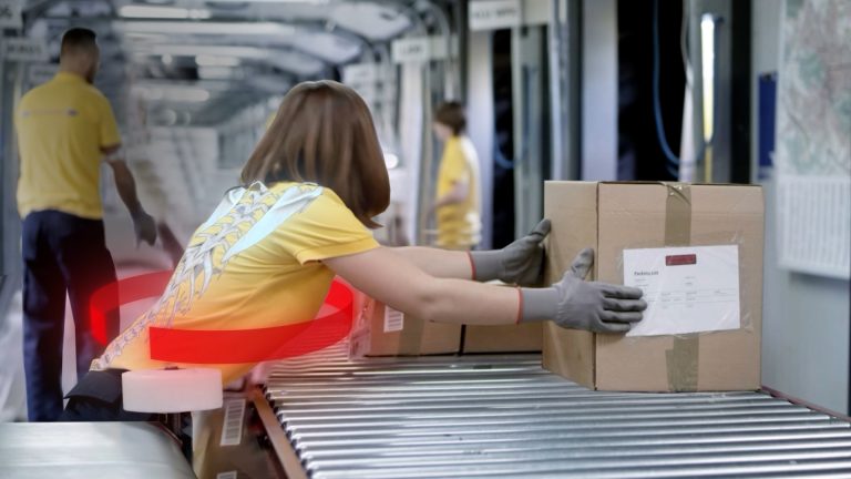
Two clients show the two halves of this guide. TuMeke is an AI ergonomics SaaS company and a client of ours for four years; the team has told us that animations make everything clear, which is the “mechanism” step of the spine above doing its job for a product that is hard to see. QuantGenie is an algo-trading SaaS company, and its team told us the domain-literate b-roll was the best they had received, a reminder that in a technical category the footage itself has to show you understand the buyer’s world. For a product like either of these, a landing page video has to carry understanding, not decoration. Read more on the TuMeke project page and on our case studies page.
FAQ
Should a SaaS landing page have a video?
Usually yes, if the product is hard to explain in a headline and a screenshot. A short video can carry the mechanism, the context and the proof that a paragraph cannot. If the product is simple and the visitor already understands it, a clear screenshot and a short proof section may do the same job with less weight on the page. The test is whether the video answers a question the page otherwise leaves open.
How long should a landing page video be?
There is no universal number, but the pattern is consistent: the above-the-fold video should be short enough that a visitor can get the point in one sitting, while a walkthrough for evaluators lower on the page can be longer because those visitors opted in. Complex products tend to justify the longer cut. Build a short and a long version from the same shoot so each placement gets the right one.
Should the landing page video autoplay?
Muted, looping, silent-by-design clips can autoplay in the background of a hero, and browsers generally allow muted autoplay. A video that carries the explanation needs sound and captions, so it is better as click-to-play with a strong poster image. If anything moves automatically for more than a few seconds, give visitors a way to pause it.
Where should the video go on the page?
Put the video that explains the product at or near the top, a walkthrough for evaluators in the product or how-it-works section, and a customer proof video near the call to action. Pricing and security pages are good homes for short objection-handling clips. Avoid stacking several videos in the same viewport; they compete for the same click.
Does video hurt page speed?
It can, if it is loaded eagerly or hosted carelessly. A video poster counts toward Largest Contentful Paint, so a heavy poster or an eagerly loaded embed can slow the page. Use a lightweight poster, lazy-load anything below the fold and load the player only when it is needed. Check the result in field data, not only in a lab test.
How do we measure video conversion rate?
Track plays, watch-through and the next action by page, then compare visitors who watched with visitors who did not, as a directional signal rather than proof of cause. Because people who choose to watch are often more interested already, confirm with a controlled test where traffic allows, for example video versus no video on the same landing page.
Verdict
Give each landing page one video with one job, put it where that job matters, load it without hurting the page, caption it and measure it by page. For a complex SaaS product that usually means an explainer or product-in-use clip near the top, a walkthrough for evaluators in the middle and a customer proof video beside the call to action. The craft that makes those videos clear is the same craft that makes them convert: a sharp promise, a visible mechanism and proof you can stand behind.
If you want a partner to turn a complex software, AI or data product into landing page video that holds up, Increditors is a video editing company that works with B2B tech teams on strategy-led video, and we are happy to talk through your pages on a call. For the wider context, see our guide to video editing for SaaS companies and our breakdown of what professional video editing costs. For another perspective on the category, see VideoEditingCompany.
Want Landing Page Video That Explains a Complex Product?
Tell us about your product and the pages that matter, and we will talk through what to show and where.