






![3D Explainer Video - ScribbleLive.mp4_snapshot_00.12_[2022.03.09_03.14.16]](https://increditors.com/wp-content/uploads/elementor/thumbs/3D-Explainer-Video-ScribbleLive.mp4_snapshot_00.12_2022.03.09_03.14.16-r7wb53mx72rxst3qcqyrfxdmeyzb5r9jbl0wbjujh4.png "3D Explainer Video – ScribbleLive.mp4_snapshot_00.12_[2022.03.09_03.14.16]")




















Lower thirds are text-based graphic overlays placed in the bottom portion of a video frame to identify speakers, locations, or key information. They are a core post-production element in corporate video, news, documentary, and YouTube content. This guide covers every type, design principle, software option, and real-world example you need to create lower thirds that inform without distracting.
What Are Lower Thirds?
Lower thirds are text-based or graphic overlays positioned in the lower portion of a video frame—typically the area between the midpoint and the bottom edge of the screen. The name originates from broadcast television, where on-screen text was conventionally placed in the lower third of the frame to avoid obscuring the subject’s face in the upper portion. That convention has outlasted the 4:3 TV era and applies equally to widescreen (16:9) and vertical (9:16) formats today.
At their most essential, lower thirds display two lines of information:
- Line 1 (primary, larger): Name, headline, or topic label
- Line 2 (secondary, smaller): Job title, organization, location, or date
In news, documentary, and corporate interview video, lower thirds establish credibility: they tell the viewer who is speaking and why that person’s perspective matters. In branded content and YouTube, they function as identity graphics—reinforcing channel or brand recognition. In live events and streaming, they deliver real-time data context without interrupting the main visual.
The Anatomy of a Lower Third
Every lower third—regardless of style complexity—is built from the same fundamental components:
- Text block: One or two lines of copy. The primary line (name or headline) is set larger; the secondary line (title, organization, or location) is set smaller and in a lighter weight.
- Background element: A solid bar, gradient fill, or custom shape that separates the text from the video footage below—critical for maintaining legibility against complex, moving backgrounds.
- Animation: An entrance motion (slide, wipe, fade) and a matching exit. The animation signals to the viewer that new information has arrived without demanding their full attention.
- Brand mark (optional): A company logo, channel icon, or network bug anchored to one side of the design for persistent brand presence.
Why the Placement Convention Matters
Keeping graphic text in the lower portion of the frame serves both practical and compositional purposes. Practically, interview subjects and presenters naturally occupy the vertical center of the frame—positioning text below them avoids obscuring faces. Compositionally, the lower position is the area viewers look to last in a scan, which means the text graphic supplements rather than competes with the primary subject.
The convention also aligns with reading conventions in left-to-right languages: viewers scan upper-left to lower-right. A lower third placed in the bottom-left corner arrives at the natural end of that visual path, reinforcing rather than interrupting information absorption.
Common Types of Lower Thirds
Not all lower thirds look or behave the same. The style you choose should align with the video’s format, production context, and intended distribution channel. Here are the five most common types in professional video production.
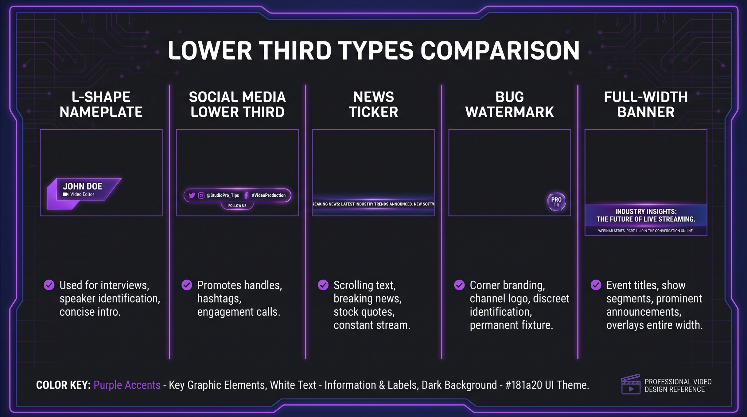
L-Shaped Name Plate (The Classic)
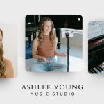
The most recognizable lower third format: a horizontal bar along the bottom of the frame with a vertical or square accent element on the left side, forming an L shape. This layout is strongly associated with news broadcasts and delivers an authoritative, credible visual tone. Line 1 typically shows the subject’s name in a bold weight; line 2 shows their title or organization in a lighter weight or contrasting color.
Best for: Corporate interviews, CEO and executive video, talking-head documentary segments, news packages, and any content where source credibility is central to the communication.
Social Media Lower Thirds
Social-optimized lower thirds prioritize boldness and mobile legibility over institutional gravitas. They tend to be full-color, often with pill-shaped or rounded rectangle backgrounds rather than hard-edged bars. Animations are punchy—quick snaps, energetic bounces—because the audience expects pace. Line 2 often shows a social handle or hashtag rather than a formal job title.
Best for: YouTube videos, Instagram Reels, TikTok, podcast clip distribution, creator-brand content.
News Ticker / Crawl
A scrolling text strip running continuously across the full width of the bottom of the frame, typically displaying a live news feed, event updates, or financial data. This differs from a standard lower third in that it is continuous and auto-scrolling—it is not a one-shot graphic for a single subject but a persistent data layer. News crawls are managed by dedicated broadcast graphics systems (Vizrt, ChyronHego) during live production.
Best for: Live broadcast news, live event coverage, financial markets video, sports ticker overlays.
Bug / Watermark Lower Third
A persistent, semi-transparent logo or station identifier placed in one corner of the frame—typically the bottom right. Broadcasters use it to brand every frame regardless of what is on screen. In content marketing video, a watermark lower third reinforces brand identity and provides attribution when clips are shared or embedded out of context.
Best for: Live streams, broadcast channel IDs, branded video series, YouTube channel branding, corporate video distributed across platforms.
Full-Width Banner
A full-width horizontal bar spanning the entire bottom of the frame, typically used during presentations, webinars, or conference keynotes to display speaker names, session titles, and event branding simultaneously. These can carry more design complexity than a standard L-shape lower third because the extra horizontal space accommodates logos, event graphics, and multi-column text layouts.
Best for: Webinars, conference keynotes, educational video courses, panel discussion video, virtual event post-production.
Design Principles for Effective Lower Thirds
A lower third is a design problem before it is a motion problem. Getting typography, color, and placement right means the animation choice becomes an enhancement rather than a distraction. These principles apply across formats and tools.
Typography: Hierarchy Without Noise
Use two weights, not two fonts. A single typeface in regular and bold (or light and semibold) creates visual hierarchy without visual conflict. Mixing two different font families in a lower third usually reads as amateur production design. Choose one neutral, highly legible sans-serif—Inter, Helvetica Neue, Neue Haas Grotesk, Source Sans 3—and vary the weight.
Limit line length to roughly 55–60% of frame width. Long names and elaborate titles can exceed this if needed, but they require either reducing font size, abbreviating (e.g., “SVP” instead of “Senior Vice President”), or widening the background element proportionally. Text running edge-to-edge always looks rushed.
Minimum readable font sizes: On a 1080p timeline, keep the secondary line (title) at 28pt or above and the primary line (name) between 36–48pt depending on design language. Smaller text suffers in compressed streaming exports, where codec artifacts cluster around fine text strokes.
Avoid all-caps for long titles. All-caps works well for short, punchy labels—a channel name, a location, a word-count designation—but makes long job titles harder to scan because the uniform letter height eliminates the visual differentiation that aids word recognition.
Color and Contrast: Legibility Over Expression
Brand color expression matters, but never at the expense of text legibility. A saturated background color that looks strong against a white design document can fight badly against warm-lit interview backgrounds or skin tones. When using brand colors, test the lower third over real footage from the shoot—not over a placeholder image.
For accessibility, WCAG guidelines recommend at least a 4.5:1 contrast ratio for standard text and 3:1 for large text above 18pt bold. These ratios matter for corporate clients with accessibility compliance requirements and for viewers watching in non-ideal conditions (bright environments, small screens).
Semi-transparent backgrounds: Reducing opacity to let the footage show through can look sophisticated, but typically a 75–85% opaque background is the minimum for reliable legibility across varied footage. Below 70%, text readability becomes too footage-dependent to control.
Animation: Timing and Easing
Entrance duration: 18–28 frames at 24fps (about 0.75–1.2 seconds). Faster than 18 frames reads as a snap—jarring and cheap. Slower than 28 frames draws the viewer’s attention away from the speaker for too long.
Hold time: 3–5 seconds minimum for the viewer to register name and title comfortably. For fast-paced social content, 2 seconds can work if the primary line is short (5–6 characters), but test with real viewers—not on your own timeline with familiarity bias.
Exit motion: mirror the entrance direction. If the lower third slides in from the left, slide it back out left. Reversing direction creates visual closure and symmetry. An opacity fade-out after a slide-in entrance breaks the spatial logic of the animation and usually reads as a technical oversight rather than a stylistic choice.
Ease in and ease out—always. Mechanical linear motion on lower thirds looks mechanical. Use ease-in-out (or the “ease” preset in your NLE) as the baseline; only break to linear motion if you specifically want a rigid, robotic aesthetic for stylistic reasons.
Broadcast Safe Zones and Frame Placement
Even outside traditional broadcast delivery, respecting safe zone conventions is best practice:
- Title safe area: Keep all text at least 10% from each edge of the frame.
- Action safe area: Keep critical visual elements at least 5% from each edge.
On a 1920×1080 frame, the title-safe boundary is roughly 192px from left and right edges and 108px from the top and bottom. Most editors position lower third backgrounds starting 70–100px from the bottom edge of the frame, landing well within safe zone parameters.
💡 Pro Tip: Test your lower third at the bottom of the frame over the actual footage you are editing—not over a placeholder clip. Interview subjects often wear clothing or sit in front of backgrounds that create contrast problems you cannot predict from a design mockup alone. A dark lower third over a dark jacket is invisible; a light lower third over a white wall disappears too. Check over real footage first.
Lower Third Examples by Video Format
Effective lower third design varies by production context. What works for a corporate earnings video would feel out of place in a YouTube vlog, and a broadcast news chyron would feel over-engineered for a social media testimonial clip. Here is how lower thirds are typically applied across the most common professional formats.
Corporate Interview and Testimonial Video
Corporate lower thirds prioritize clarity, brand alignment, and source credibility. A typical treatment at production level: dark background bar in brand navy or black, name in white bold at approximately 42pt, title in brand accent color at approximately 30pt, entrance slide from left over 22 frames with ease-in, exit slide back left over 18 frames, hold for 4 seconds then exit before the next cut. The background bar opacity is 90–100%—fully solid—to ensure the text survives compression in delivered MP4 files.
The key constraint for corporate delivery is codec compression. Heavy gradients and thin font strokes compress poorly at standard bitrates, producing ringing and blocking artifacts visible around text. Solid or near-solid background fills with bold fonts consistently survive H.264 and H.265 compression better than complex graphic treatments.
News and Documentary
In documentary and long-form journalism, lower thirds carry editorial weight: they establish source credibility and make the production responsible for the accuracy of every displayed title. A wrong title—even a minor variation from what the subject actually holds—can undermine audience trust and require costly re-delivery.
Documentary best practices: clear factual content (name, title, organization), neutral typography (avoid decorative or display fonts), minimal animation (a soft wipe or 12-frame fade), and placement early in the interview clip—within the first 3–5 seconds—rather than mid-sentence. Re-identifying a returning interviewee at their second or third appearance uses a shorter hold time, since the viewer has already registered the name.
YouTube and Creator Content
Creator lower thirds have the most creative latitude and simultaneously the highest consistency demands. They are brand-building moments, not just information delivery—and a channel’s lower third template is part of its visual identity, just like its thumbnail style and intro animation.
Common creator approaches include channel colors as the background element, rounded pill-shaped backgrounds rather than hard-edged bars, social handles on line 2 instead of formal job titles, and short hold times (2–3 seconds) tuned for an audience with a faster content pace. The visual risk is inconsistency across a channel’s library: a lower third system (a template file with consistent color variables) saves significant re-editing time as the channel scales. Working with a dedicated video editing agency gives creator-brand channels a consistent template infrastructure maintained across every episode, so the visual identity holds as the upload schedule grows.
Live Stream and Event Video
Live productions add real-time complexity: lower thirds are often driven by a graphics operator who types names live using a dedicated CG system (Vizrt, Ross Video, NewTek TriCaster). The design work happens in pre-production—building the template—and execution happens during the broadcast. For pre-produced event recap and highlight packages, the lower third design and timing principles match documentary: accurate, legible, and restrained.
For streaming platforms (Twitch, YouTube Live), many creators use browser-source overlays through tools like Streamlabs OBS that pull dynamic data—subscriber counts, donation amounts, viewer totals—into live lower third displays. These live-data lower thirds follow the same design principles as pre-produced graphics but require overlay systems to handle the animation logic.
Tools and Software for Creating Lower Thirds
The tool you use depends on your NLE ecosystem, motion graphics skill level, and whether you need one-off graphics or a reusable template system. Here is a clear breakdown of the most widely used options in professional production.
Adobe After Effects
After Effects is the industry standard for custom lower third design and animation. Designs are built in the Composition panel; animation is controlled on the timeline with keyframes and expressions. The real production advantage is the Essential Graphics panel: lower thirds designed in After Effects are exported as Motion Graphics Templates (.mogrt files) that Premiere Pro editors can use directly, swapping text, colors, and logo assets through a simple controls panel—no After Effects license required to use the template.
The Expression language in After Effects enables dynamic behavior: text blocks that auto-resize their background bar, color controls driven by a single slider, and text that scales down automatically when a name exceeds character limits. Adobe’s After Effects documentation covers the full Essential Graphics and expression workflow for production-ready motion graphics templates.
Adobe Premiere Pro
Premiere Pro’s Essential Graphics panel includes a built-in title engine and accepts .mogrt files from After Effects. For quick one-off lower thirds on a corporate project or a single-episode production, Premiere’s built-in Motion Graphics Templates provide a fast path without an After Effects license. The limitation is reduced animation control—no expression logic—and fewer options for dynamic auto-sizing. Premiere Pro’s official documentation covers the Essential Graphics panel in full.
DaVinci Resolve (Fusion)
DaVinci Resolve’s Fusion page provides a node-based compositing environment comparable in power to After Effects. Lower thirds designed in Fusion can be published as macros—Fusion’s equivalent of After Effects templates—and reused across projects in the Edit page. The integrated workflow is particularly valuable: editors already cutting in Resolve avoid round-tripping to a separate application. Blackmagic Design’s DaVinci Resolve also offers a free tier with full Fusion capabilities, making it the most accessible professional option for teams not on the Adobe Creative Cloud ecosystem.
Apple Motion
Apple Motion is the natural lower third tool for macOS editors working in Final Cut Pro. Templates designed in Motion integrate directly into Final Cut’s Title browser—editors apply them like text layers with no compositing knowledge required. Broadcast and network TV teams working in FCP often build lower third systems entirely in Motion, where the template architecture and real-time preview performance align well with live and near-live turnaround requirements. Motion is a one-time ~$50 purchase rather than a subscription, which appeals to independent editors with stable NLE setups.
CapCut, Canva, and Mobile-First Tools
For creator-first workflows and social media lower third production, CapCut and Canva offer pre-built templates you can customize with brand colors and export immediately. Animation controls are limited compared to After Effects or Fusion, but the time-to-output is dramatically shorter for solo creators without a dedicated motion graphics background. Canva’s design education library also provides useful grounding in typography contrast and color hierarchy before you invest time in a more complex tool.
Lower Third Design Checklist and Best Practices
Use this reference checklist before locking a lower third design system for a project or content series. Each element represents a common point of failure or a decision that compounds across many deliverables if handled inconsistently.
Common Lower Third Mistakes to Avoid
These are the errors that appear most frequently in post-production quality reviews—and the ones that are most expensive to fix after a deliverable has been approved and distributed.
Misspelling the Subject’s Name or Title
This is the highest-visibility error in any video with lower thirds and the one most likely to require a complete re-export. Collect a spelling confirmation from each interview subject before the shoot—a simple email asking them to confirm their name, title, and organization spelling. For larger productions, a standard intake form covers this alongside release agreements and B-roll notes. One wrong letter discovered after distribution means re-encoding, re-uploading, and notifying every platform the video lives on.
Over-Animating
Motion draws the eye. An overly animated lower third—bouncing, scaling up, color-cycling through brand palette, particle burst on exit—competes visually with the speaking subject, defeating the purpose of the graphic. The lower third should arrive, inform, and depart without demanding viewer attention. Restraint is the professional signal; complexity is the amateur one.
Ignoring Codec Compression
Fine strokes (1–2px borders), complex gradients, and detailed textures in lower third backgrounds compress poorly in H.264 and H.265 at standard streaming bitrates. What appears crisp in the NLE preview may show visible ringing and blocking artifacts in the exported file—particularly around thin text strokes and gradient edges. Design with compression in mind: solid fills, bold fonts, and generous stroke widths consistently survive export better than delicate graphic treatments.
Template Inconsistency Across Episodes
If episode 3 uses a serif font and episode 7 uses a sans-serif, the series or channel loses visual coherence. This happens most often when different editors work on different episodes without a shared template file. The solution is a properly built template (After Effects .mogrt, Fusion macro, or Motion template) distributed to all editors before production begins, with any color or brand variable locked to a single source file. Understanding the true cost of professional video editing includes accounting for the template development investment that makes consistent multi-episode delivery economically viable.
Not Testing at Delivery Resolution
Lower thirds designed at 1920×1080 for full-screen playback often do not look the same at the resolutions viewers actually experience: 1280×720 (YouTube default stream quality), 854×480 (mobile data save mode), or embedded in a 600px-wide email or web article. Text that reads comfortably at native resolution may become illegible at half-size or in a compressed embed. Check your lower third design at multiple output sizes before locking the template for a series.
💡 Pro Tip: Build your lower third template before the first shoot, not after. Post-production template development while a content series is already in production forces retrofitting, re-editing, and inconsistency across episodes already delivered. Front-load the design work when there is time to iterate; the per-episode editing cost drops significantly once a solid template system is in place. This is standard practice for video content programs that scale beyond the initial pilot phase.
FAQ
How long should a lower third remain visible on screen?
Industry convention runs 3–5 seconds for a name-and-title lower third. That range gives a viewer enough time to read the name, pause, read the title, and register the information before the graphic exits. For fast-paced promotional video or social content, 2–3 seconds can work when the primary text is very short (a first name only, a brief label), but test with a representative viewer rather than relying on self-assessment—familiarity with the name creates a false impression of how quickly it reads to someone encountering it cold.
Can lower thirds be used in vertical (9:16) video?
Yes, but placement and scale change relative to the frame. On a vertical frame, the “lower third” area occupies a proportionally wider band because the shorter horizontal dimension compresses the available space. Text scales up to remain legible at the smaller screen sizes where vertical video is most often consumed (mobile). Many mobile NLEs and creator tools like CapCut handle this adjustment automatically within their vertical templates. The same typography, contrast, animation timing, and safe zone principles apply regardless of aspect ratio.
What file format should I use when delivering lower thirds as separate graphic files?
If delivering lower thirds as layered graphics for another editor to composite, export from After Effects as a .mogrt (for Premiere Pro editors) or as a .mov file with an alpha channel (ProRes 4444 or DNxHR with alpha). For DaVinci Resolve editors, share the Fusion macro or a pre-composited .mov with alpha. Never deliver lower thirds as JPEG (no alpha channel support) or as PNG with a white background unless the client specifically requests it for a white-background design.
Should a lower third appear at the start of a clip or after the cut?
For interview and documentary content, convention places the lower third entrance 0.5–1 second after the cut to the speaker—not on the cut itself. This brief delay gives the viewer a moment to register the person’s face before the graphic arrives, so the two pieces of information (face recognition, name confirmation) arrive in natural sequence rather than simultaneously. For a returning interviewee appearing later in the same video, the lower third can hold for a shorter duration on re-identification since the viewer has already processed the name once.
How do I handle lower thirds for multi-language or localized video?
Localization requires planning at the template design stage. Translated job titles and organizational names are frequently longer than their English equivalents—German and Finnish especially. Before finalizing the background bar width and font size, fill the template with the longest plausible translated title you expect to encounter. If the design breaks at that length, adjust the bar width, reduce font size, or both before the template is distributed to editors. For subtitled versions, position the name lower third slightly higher than the standard placement to avoid collision with subtitle text in the caption safe area.
Verdict
Lower thirds are one of the highest-frequency design decisions in professional video production. Get them right—clean typography, brand-consistent color, accurate information, appropriate timing, codec-resilient design—and they are invisible in the best possible sense: they inform without intruding. The viewer absorbs who is speaking and why it matters without being pulled out of the content.
Get them wrong—wrong names, inconsistent styling across episodes, poor contrast, over-animation, thin strokes that collapse under compression—and they pull viewers out of the story and undermine the production’s credibility in ways that are disproportionately costly relative to the size of the error. A misspelled title in a CEO testimonial video can require a full re-encode and re-distribution across every platform the piece lives on.
The investment in a properly built lower third template system—designed once, distributed to all editors, maintained across a content series—is one of the highest-return post-production decisions a content team can make. It reduces per-episode edit time, ensures consistent brand identity, and eliminates the category of errors that only appear after delivery.
For content teams scaling video production and needing a dedicated post-production partner to build and maintain motion graphics template systems, the complete guide to video editing for SaaS and growth-stage companies outlines how specialist editing partners approach content infrastructure. Working with an expert video editing agency means your lower thirds—and every motion graphics element across your video library—stay consistent, on-brand, and accurately spelled across every deliverable, every editor, and every season.
Ready for Video That Actually Converts?
Tell us about your project and we will put together a custom plan.