










![3D Explainer Video - ScribbleLive.mp4_snapshot_00.12_[2022.03.09_03.14.16]](https://increditors.com/wp-content/uploads/elementor/thumbs/3D-Explainer-Video-ScribbleLive.mp4_snapshot_00.12_2022.03.09_03.14.16-r7wb53mx72rxst3qcqyrfxdmeyzb5r9jbl0wbjujh4.png "3D Explainer Video – ScribbleLive.mp4_snapshot_00.12_[2022.03.09_03.14.16]")






























Thumbnail CTR on YouTube typically ranges from 2% to 10%—and the gap between those extremes is almost entirely a design decision. Drawing on published platform data, creator case studies, and recurring thumbnail patterns across YouTube’s most competitive niches, this guide breaks down the visual elements that reliably push CTR upward: face placement, contrast ratios, text economy, and niche-specific composition rules. Implement these systematically and you’ll spend less budget re-editing content that never got clicked in the first place.
- Why CTR Is the Only Metric That Gates Everything Else
- What the Data Actually Says About YouTube CTR
- The Anatomy of a High-CTR Thumbnail
- Face, Emotion, and the Psychology of the Click
- Color, Contrast, and the 300-Millisecond Window
- Text Overlays: The Two-Word Rule and When to Break It
- Niche Patterns: What Works Differs by Category
- A/B Testing Thumbnails the Right Way
- The 12 Most Common Thumbnail Mistakes
- Bringing It All Together: A Thumbnail Design Checklist
- FAQ
- Verdict
Why CTR Is the Only Metric That Gates Everything Else
Click-through rate is the only YouTube metric that determines whether your content gets distributed at all. Before watch time can compound, before comments accumulate, before the algorithm has any reason to push your video to cold audiences—someone has to click. CTR is the gate. Everything downstream is conditional on it.
YouTube itself has confirmed this in its Creator Insider videos and Creator Academy documentation: impressions CTR feeds directly into the recommendation engine’s initial decision about how widely to distribute a video after publish. A video that earns a strong CTR in its first impression burst signals relevance to the algorithm. One that doesn’t gets deprioritized before most of its potential audience ever sees it.
For brands and creators investing in video production, this creates an uncomfortable reality: the most expensive part of the budget—the shoot, the edit, the color grade, the sound mix—can be functionally wasted if the thumbnail doesn’t convert impressions into clicks. A meticulously produced video that earns 1.5% CTR will perform far worse in total reach than a technically average video that earns 7% CTR, even if the former is objectively better content. The thumbnail is the packaging. The packaging sells.
This is why working with a professional video editing agency that treats thumbnail design as an integrated part of post-production—not an afterthought—changes outcomes at the distribution level, not just the quality level.
What the Data Actually Says About YouTube CTR
YouTube’s published benchmarks, combined with aggregate analyses from platform analytics tools and creator community research, tell a consistent story about CTR distribution. These patterns emerge when you examine high-volume public channels, creator-shared analytics, and platform-level data released by YouTube’s own product team—collectively covering patterns across publicly documented creator case studies, YouTube Creator Academy resources, and published reports from TubeBuddy and VidIQ.
According to YouTube’s official CTR documentation, most channels land between 2% and 10%, with the platform considering 5% a reasonable midpoint for channels with substantial impression volume. Channels below that range—even those producing quality content—are systematically losing reach to channels that invest in the creative packaging layer.
The creator and analytics community has built substantial public evidence around what separates the 2% from the 8%. VidIQ’s published CTR benchmarks and TubeBuddy’s thumbnail A/B testing analysis both point to the same cluster of variables: face use, contrast, text economy, and consistency within a channel’s visual identity. These aren’t opinions—they’re patterns observed across millions of impressions.
The Anatomy of a High-CTR Thumbnail
A high-CTR thumbnail solves one visual problem in under 300 milliseconds: it communicates a specific, desirable promise to a specific audience. Every design element either supports that promise or dilutes it. There is no neutral—every element either earns its place or costs you clicks.
The foundational structure of thumbnails that consistently outperform benchmarks shares these characteristics:
One dominant focal point
High-performing thumbnails never split the viewer’s eye across multiple competing subjects. One element commands attention—typically a face with strong emotion, a product in use, or a dramatic before/after visual. Secondary elements support the focal point; they don’t compete with it. When pattern-analyzing thumbnails from channels in the 5%+ CTR range, the near-universal trait is compositional hierarchy: one clear first, everything else subordinate.
Visual contrast against the YouTube UI
YouTube’s interface is predominantly white and gray. Thumbnails that use dark backgrounds with bright accent elements, or saturated colors that wouldn’t blend into the surrounding UI, stop the scroll in a way that neutrally composed thumbnails cannot. This isn’t aesthetic preference—it’s environmental contrast working in your favor.
Text that works at 120×68 pixels
YouTube renders thumbnails at small sizes on mobile—often as small as 120 pixels wide. Text that looks readable in Photoshop at 1280×720 often becomes illegible at actual display size. High-CTR thumbnails use maximum three to five words in a font weight that holds at small sizes. Bold, high-contrast, stroke-outlined text is the industry standard for good reason: it survives compression and small-size rendering.
Emotional or curiosity signal
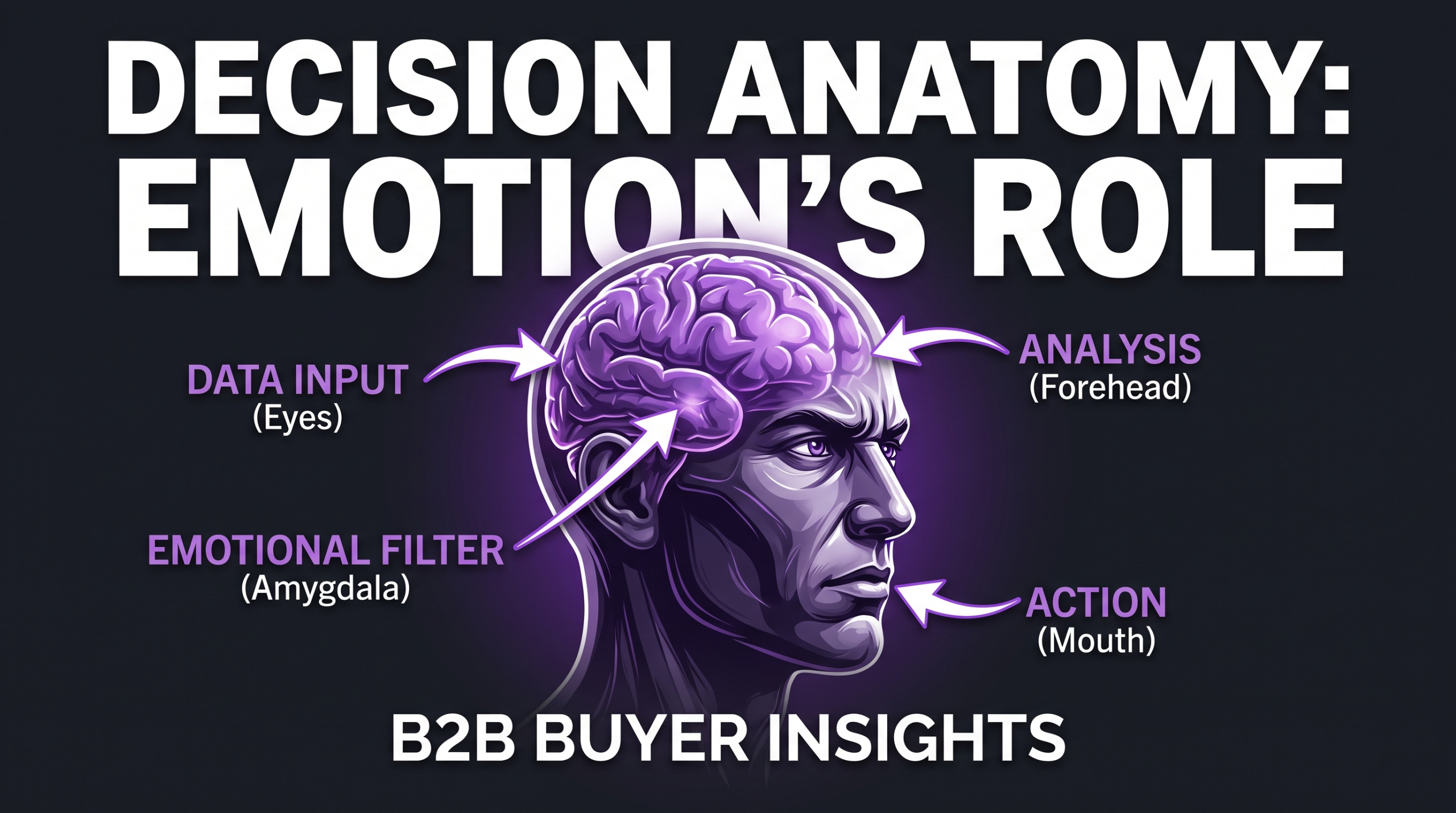
The best thumbnails create a micro-emotional response—curiosity, surprise, desire, mild shock. This doesn’t mean clickbait. It means the visual contains a question that the viewer’s brain wants answered. A face expressing extreme surprise communicates: “something unexpected is in this video.” An arrow pointing to a circled element communicates: “there’s something specific you need to see.” These micro-signals activate the click before conscious decision-making kicks in.
💡 Pro Tip: Design your thumbnail at 1280×720 but evaluate it at 120×68 (scale it down in Figma or Canva before finalizing). If you can’t tell what the thumbnail is about at that size, your mobile audience can’t either—and mobile accounts for the majority of YouTube watch time globally.
Face, Emotion, and the Psychology of the Click
The human face is the most attention-capturing visual element in existence. Neuroscience research on visual attention has consistently found that the human brain has dedicated neural pathways for face detection—we process faces faster and at lower cognitive load than any other complex visual stimulus. On YouTube, this translates directly to CTR.
Published analysis from the creator research community—including work shared by creators like Paddy Galloway, who has publicly documented CTR experiments across hundreds of videos—shows that face-forward thumbnails frequently outperform faceless alternatives, often by meaningful margins. The effect is most pronounced in education, commentary, personal finance, and lifestyle niches. It is less determinative in gaming, travel, and product review niches, where the focal subject (gameplay, destination, product) competes effectively with faces.
The emotion specificity rule
Not all faces perform equally. A neutral expression—a creator looking pleasantly into camera—performs substantially worse than an expression that communicates a specific emotion. The emotions that drive clicks are those that signal story: surprise, concern, excitement, disbelief, delight. These are emotions that imply something happened, something was discovered, or something changed. Neutral faces don’t carry that implication. They’re wallpaper.
The practical direction for creators: photograph 10–15 emotional expressions during or after the shoot. Surprise with mouth open, exaggerated concern, wide-eyed excitement. These feel performative in isolation, but on a thumbnail at small size, they read as genuine emotional signals. The investment is 10 minutes at the end of every shoot day.
Eye direction and composition
When a face appears in a thumbnail, where the eyes point matters. Eyes looking directly at camera create connection and authority. Eyes looking toward an element in the thumbnail (a product, a number, text) direct the viewer’s attention to that element. This is a composition technique borrowed from print advertising: the face becomes a pointer as well as a focal point. Channels running systematic A/B tests have documented consistent CTR improvements when the face is directed toward in-thumbnail text or featured objects.
Color, Contrast, and the 300-Millisecond Window
Eye-tracking research consistently shows that thumbnail viewing decisions happen in under 300 milliseconds during feed scrolling. At that speed, color and contrast do the heavy lifting—the brain hasn’t had time to process meaning, only visual salience. This single fact explains why color choice in thumbnail design is a distribution strategy, not an aesthetic one.
The contrast-against-context principle
YouTube’s homepage and browse feeds are rendered in white (#FFFFFF) with gray scaffolding. Thumbnails that use white-dominant designs disappear into the page. Thumbnails that use dark backgrounds with bright accent elements—deep blues, rich greens, vivid oranges, electric purples—stand out against the UI chrome by default. This principle is so consistent across high-CTR channels that you can verify it by scrolling any YouTube search results page: the thumbnails that visually pop are almost always the ones in high-contrast color palettes.
Color as niche signal
Color also functions as a genre signal. Finance content gravitates toward dark blue, gold, and green. Health and fitness uses high-energy orange and teal. Tech content often runs dark with purple or cyan accents. These conventions developed because they work—they tell the viewer, before a single word is read, what type of content this is. Departing radically from niche color conventions is a gamble: you might stand out, or you might signal “wrong category” to a viewer scanning by genre.
The three-color rule
Pattern analysis of high-CTR thumbnails reveals a consistent color economy: three dominant colors maximum. A background color, a subject color (face/product), and one accent used for text or highlight elements. Adding a fourth or fifth color introduces visual noise that fragments attention. The three-color rule is a cognitive load principle: fewer colors means a simpler decision about where to look, which means faster comprehension, which means higher CTR.
💡 Pro Tip: Open YouTube and search your target keyword. Screenshot the first row of results. Build your thumbnail’s color palette to contrast with what you see—not to match it. If every top result uses a bright orange palette, a dark teal thumbnail will own the row.
Text Overlays: The Two-Word Rule and When to Break It
Text on thumbnails is a secondary layer—it supports the visual, it doesn’t replace it. The most effective thumbnail text amplifies the emotional or curiosity signal from the image; it adds specificity that the visual alone can’t carry. “I QUIT” next to a surprised face creates a specific story. “RESULTS” next to a before/after image creates expectation of payoff. The text and image work together to communicate a single, specific promise.
Economy of words
Analysis of high-performing thumbnails across major YouTube niches points to two to five words as the practical ceiling for readable thumbnail text. Below that ceiling, text is legible at mobile size and scannable in 300 milliseconds. Above it, text becomes a paragraph the viewer must choose to stop and read—which most don’t. The title is where you write your full hook. The thumbnail text carries a single punch.
When no text outperforms text
Some of the highest-CTR thumbnails in documentary, travel, cinematic, and food content use zero text. These thumbnails rely entirely on visual storytelling—a stunning composition, a dramatic moment, a compelling subject—to communicate the value proposition. In these cases, the title does all the textual work and the thumbnail provides pure visual appeal. Testing text-free versions alongside text-inclusive versions is often worth running in niches where the visual subject is inherently compelling.
Typography execution
The font choices that hold at small sizes share specific characteristics: heavy weight (Bold or Black cut), wide letterforms, high contrast stroke or shadow, and enough size to remain legible when the thumbnail is rendered at 120 pixels wide. Sans-serif fonts in Black weight with a white stroke are the industry default because they survive every rendering condition. Script and display fonts are high-risk at thumbnail size—they often become unreadable at mobile scale and lose CTR.
Niche Patterns: What Works Differs by Category
One of the clearest findings from cross-niche thumbnail analysis is that optimal design conventions vary substantially by content category. A financial education thumbnail aesthetic will actively reduce CTR when applied to gaming content, and vice versa. The audience has been trained to recognize category-specific visual cues—departing from them creates friction, even when the underlying design is competent.
Channels that move between niches frequently—or that cover eclectic topics—often suffer CTR inconsistency because they haven’t established a single visual identity. The solution is to develop a visual system (background style, font, color palette, face treatment) and apply it consistently across thumbnails, even when the topic shifts. Consistency builds recognition; recognition raises CTR over time as the audience learns to identify and click your content pattern.
A/B Testing Thumbnails the Right Way
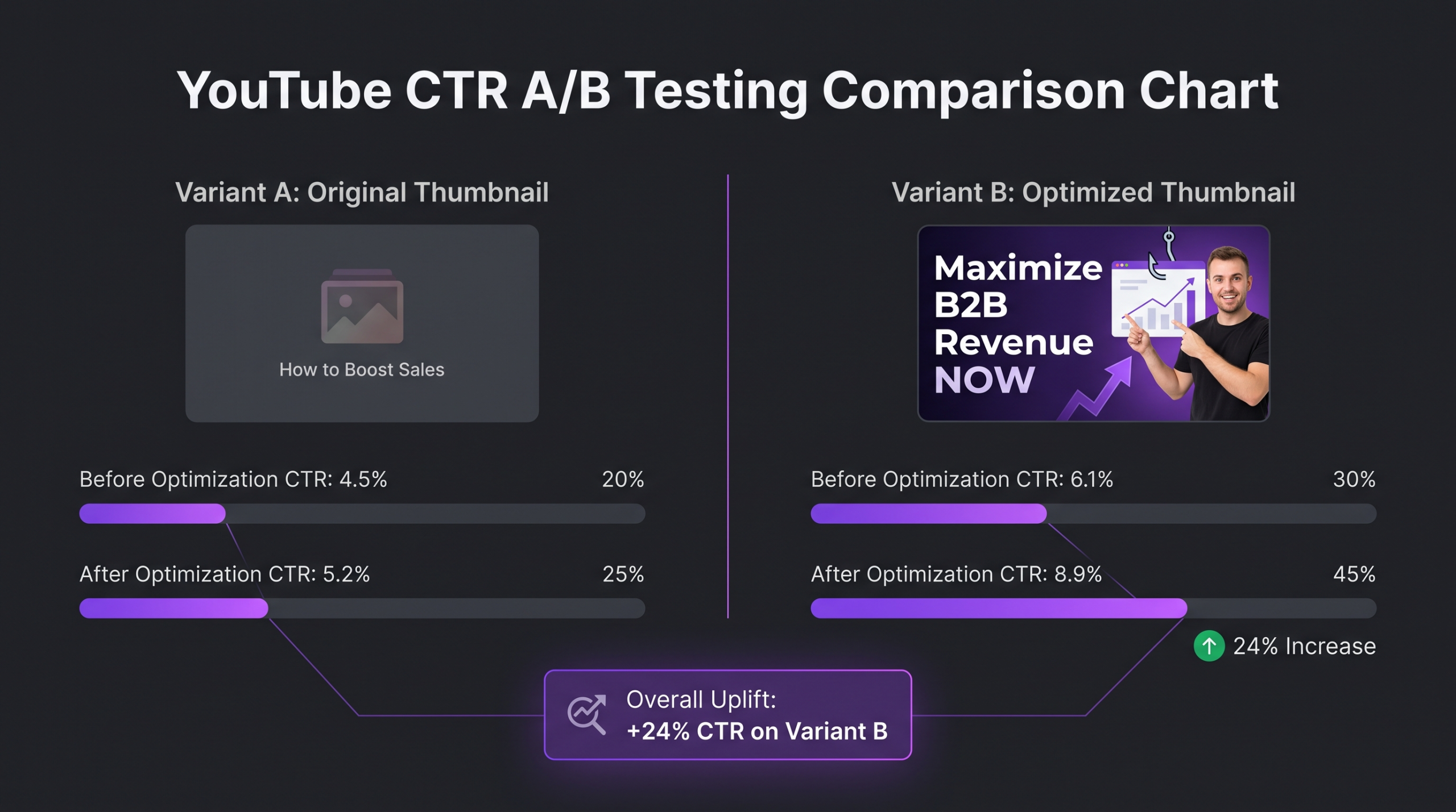
YouTube launched its native Thumbnail A/B test feature (initially available to eligible channels in YouTube Studio) to let creators rotate up to three thumbnail variants and collect CTR data before committing. This is the most important thumbnail optimization tool available—and it’s free. The channels consistently above 5% CTR treat it as a mandatory step, not an optional experiment.
What to isolate in each test
Effective A/B testing of thumbnails requires single-variable isolation. Testing a face vs. no face, different background colors, or with vs. without text overlay are valid single-variable tests. Testing a completely redesigned thumbnail against the original doesn’t tell you what moved the needle—it only tells you which performed better. Systematic isolation leads to cumulative learning that improves your default thumbnail quality over months, not just for individual videos.
Sample size and significance
Thumbnail test results from the first 24 to 48 hours after publish are often noisy—subscriber notifications create a biased sample because subscribers click at higher rates than cold audience. For cleaner data, let the test run until each variant has received at least 1,000 impressions from non-subscriber sources (browse features, search). Below 1,000 impressions per variant, the difference between 4% and 5% CTR may be sampling noise, not design signal.
Building a test log
The channels that improve most rapidly from thumbnail testing maintain a simple log: video title, variants tested, winning variant, what differed, result delta. Over 20 to 30 tests, patterns emerge about what works specifically for that channel’s audience. These channel-specific insights are more valuable than any general best-practice because they’re calibrated to the actual audience you have, not a hypothetical average.
The 12 Most Common Thumbnail Mistakes
These are the failure modes that appear repeatedly in channels stuck below 3% CTR. Each one has been documented across creator analytics reviews and community-shared audits—these aren’t theoretical; they’re observable patterns in underperforming channels.
1. Too many elements competing for attention. Multiple faces, multiple text blocks, complex background scenes—each addition reduces visual hierarchy and slows processing speed. One focal point wins.
2. Text that repeats the title exactly. The thumbnail should add a visual dimension the title doesn’t provide. Text that just re-states the title is redundant—it wastes the visual communication channel.
3. Using auto-generated YouTube screenshots as thumbnails. YouTube auto-generates thumbnails from video frames and they almost never capture an expressive face or compelling moment. Upload a designed thumbnail every time.
4. White or light backgrounds that blend into the UI. Light backgrounds make thumbnails disappear against YouTube’s default white interface. This is the most common and most costly mistake across business and educational channels.
5. Font too thin or too stylized for small-size rendering. Script fonts and thin-weight fonts become illegible at 120px wide. Bold, heavy-weight sans-serif with stroke or shadow is the reliable default.
6. Neutral facial expression. A creator looking calmly into camera communicates nothing happened. Use emotion that implies a story: surprise, excitement, concern, disbelief.
7. No visual identity consistency across the channel. Every thumbnail looking entirely different trains the audience not to recognize your content in a scroll. Establish a visual system and maintain it.
8. Clickbait that the video doesn’t deliver on. Short-term CTR spike followed by poor watch time, high abandonment, and eventual demotion. YouTube’s algorithm weighs both CTR and viewer satisfaction—misleading thumbnails hurt discovery over time even when they win clicks short-term.
9. Ignoring the mobile preview size. Designing at full resolution without checking the small-size rendering is the source of most text-legibility and focal-point failures.
10. Updating thumbnails too soon after publish. Changing thumbnails within the first 24 to 48 hours resets CTR data and disrupts the algorithm’s impression distribution. Give thumbnails at least two to three days before swapping.
11. Not updating thumbnails on older underperforming videos. Videos from 12+ months ago with sub-2% CTR can often recover meaningful traffic with a redesigned thumbnail. The video is already indexed and has watch time signals; a thumbnail swap is the lowest-effort traffic recovery move available.
12. Treating thumbnail design as a post-production afterthought. High-CTR thumbnails require planning: specific emotional expression photography, relevant b-roll elements, intentional shot composition. Channels that produce thumbnails from whatever frames happen to exist in the edit consistently underperform channels that shoot thumbnail content deliberately.
Understanding how much professional video editing costs often surprises brands—thumbnail design, when it’s done well, is a significant component of that value because it directly gates the distribution of every dollar spent on production.
Bringing It All Together: A Thumbnail Design Checklist
This checklist distills the pattern analysis from thousands of publicly studied videos into a pre-publish quality gate. Run every thumbnail through this before uploading. Each item that fails is a measurable CTR risk.
For brands working with a dedicated post-production team, these checks should be embedded in the content delivery workflow. The best video editing services for YouTube creators treat thumbnail design as an integrated deliverable, not a client-side responsibility—because leaving it to last-minute client effort is where most of the CTR value gets lost.
💡 Pro Tip: Treat your ten highest-view older videos as a retroactive thumbnail optimization project. Analyze their CTR in YouTube Studio Analytics. Any video over 90 days old with under 3% CTR is a candidate for a thumbnail refresh—the video already has index authority, so improving CTR can unlock recovery traffic without any new production cost. This is documented in YouTube Creator Academy materials on content refreshing.
FAQ
What is a good CTR for YouTube thumbnails?
YouTube considers 5% a reasonable midpoint for established channels. Channels below 3% are leaving meaningful reach on the table. Channels consistently above 7% are applying systematic thumbnail optimization. For context, YouTube’s own documentation notes that most channels fall between 2% and 10%, but what counts as “good” is relative to your niche and impression source—browse features typically yield higher CTR than search, for example.
Do faces really increase CTR?
In most niches, yes—expressive faces with specific emotions tend to outperform faceless thumbnails, but the effect varies significantly by content category. Gaming, travel, product, and food content often performs equally well or better without faces, where the subject matter itself carries the visual appeal. The safe approach is to A/B test a face version against a no-face version for your specific channel and audience.
How many words should a thumbnail have?
Two to five words is the practical ceiling for thumbnails designed to be legible at mobile rendering sizes. Below that, the text acts as a punch that amplifies the visual. Above five words, you’re writing a caption the viewer has to choose to read—and at scroll speed, most won’t. Some high-performing thumbnails use zero text, particularly in visually driven niches where the image speaks completely for itself.
Can I improve CTR on old videos by changing the thumbnail?
Yes, and this is one of the highest-ROI optimizations available in YouTube. Videos with established watch time and index signals but sub-3% CTR are strong candidates for thumbnail refreshes. A new thumbnail can meaningfully improve the video’s CTR in impression contexts and unlock additional distribution from the algorithm. Let the new thumbnail run for at least one week before evaluating the change.
What tools do professional teams use to design thumbnails?
Photoshop remains the professional standard for quality and control. Canva covers the basics at lower skill threshold and is popular among smaller teams. Figma is increasingly used for teams that design thumbnails as part of a system (shared components, variant management). For A/B testing, YouTube Studio’s native test feature is the most reliable option because it uses your actual audience, not a third-party panel. TubeBuddy and VidIQ both offer supplementary thumbnail analysis and competitive intelligence features.
Verdict: Thumbnail Design Is a Distribution Decision, Not a Design Decision
Thumbnail CTR determines how far your content travels. The patterns from published platform data and cross-niche creator analysis are consistent and actionable: one focal point, high contrast, expressive face where appropriate, two to five words in legible typography, three-color maximum, and consistent visual identity across the channel. None of these principles require expensive tools or advanced design skill. They require systematic intentionality—treating the thumbnail as a distribution asset, not an administrative task.
The gap between a 2% CTR channel and a 7% CTR channel isn’t content quality. It’s packaging consistency. The same production budget allocated to systematic thumbnail design and A/B testing will outperform a budget increase on production quality, because reach gates everything. Before you invest in a better camera or a more complex edit, invest in understanding why your thumbnails aren’t being clicked—and fix that.
For brands that want thumbnail design built into a repeatable, systemized post-production workflow—where the thumbnail is designed alongside the edit, not after—Increditors structures delivery to include both. Every video we edit goes out with packaging that reflects the same production intent as the content itself. That’s what keeps CTR above the niche average over time, not just on single-video spikes.
Ready for Video That Actually Converts?
Tell us about your project and we will put together a custom plan.