








![3D Explainer Video - ScribbleLive.mp4_snapshot_00.12_[2022.03.09_03.14.16]](https://increditors.com/wp-content/uploads/elementor/thumbs/3D-Explainer-Video-ScribbleLive.mp4_snapshot_00.12_2022.03.09_03.14.16-r7wb53mx72rxst3qcqyrfxdmeyzb5r9jbl0wbjujh4.png "3D Explainer Video – ScribbleLive.mp4_snapshot_00.12_[2022.03.09_03.14.16]")































Caption style is a retention lever, not just an accessibility checkbox. There are six main style families — word-by-word kinetic, full-line subtitle, speaker-labeled, branded graphic, emoji-enhanced, and highlight-word animated — and matching the right one to your platform, content type, and audience makes a measurable difference in how long viewers stay. This guide covers when to use each style, the typography variables that matter most, common mistakes, and a practical workflow for testing caption changes against real retention data.
Caption Style Is a Retention Decision
Most video teams treat captions as a finishing step — you export the file, run it through auto-transcription, drop the SRT onto the timeline, and ship. That workflow treats captions as compliance infrastructure. The evidence from platform analytics consistently tells a different story: how you style captions shapes whether viewers stay or leave, particularly in the first 10–30 seconds when retention curves are steepest.
Meta’s own published guidance on video best practices has long noted that a large majority of video on Facebook and Instagram is watched without audio — their internal data has put that figure at more than 85% in feed contexts. LinkedIn and TikTok have published similar observations for their platforms. The implication is that captions are not supplementary — for a substantial share of your audience, they are the primary channel through which your message lands.
The Silent Viewing Reality
A 2019 study by Verizon Media found that 69% of people watch video in public places with sound off, and 25% keep sound off even at home. These viewers are not accidentally muted — they are deliberately in silent mode, relying entirely on captions to follow along. When a caption is delayed, too small to read on mobile, or styled in a way that clashes with the visual hierarchy of the frame, these viewers experience friction. Friction produces drop-off. The captions did not fail at accessibility; they failed at retention.
There is also a comprehension angle for viewers who watch with sound on. Research compiled by 3Play Media shows that captions improve comprehension for viewers whose first language differs from the video’s spoken language — a significant segment of most global audiences. Well-styled captions reinforce spoken words visually, which reduces cognitive load and supports longer viewing sessions.
How Style Affects Drop-Off
Caption style choices affect retention through three mechanisms: reading speed alignment (captions that appear faster or slower than a viewer reads create dissonance), visual hierarchy (captions that compete with the subject’s face or the title card for attention fragment focus), and tone signaling (a mismatched style — say, casual word-by-word pop captions on a polished corporate keynote — signals to the viewer that the content is less considered than it should be, which erodes trust).
Teams that understand these mechanisms make caption decisions before the edit, not after. The caption style is part of the creative brief, chosen alongside color grade, music, and pacing.
The Six Caption Style Families
Within the broad landscape of caption design, six distinct style families have emerged as the dominant patterns across short-form, long-form, and branded video. Each has a different visual signature, a different cognitive effect, and a different range of contexts where it outperforms the alternatives.
1. Word-by-Word Kinetic Captions
Each word appears and disappears in sync with speech, creating a rhythmic pulse that mirrors the cadence of the speaker. Made popular by content-creator culture on TikTok and Instagram Reels, this style is high-energy and draws the eye to the center or lower-center of the frame. It pairs well with fast-paced speech (120–180 wpm) and punchy hooks.
The limitation is also rooted in its strength: because only one or two words are visible at any moment, it forces the viewer to stay tethered to the caption. For complex ideas with multi-clause sentences, this style actively impedes comprehension because there is no context window — you cannot glance back a word to catch a concept you missed. For hooks and calls to action it excels; for explanatory content it frustrates.
2. Full-Line Subtitle Blocks
The traditional format: one to two lines of text appear at the bottom of the frame, hold for their readable duration, then are replaced by the next block. This is the format used by broadcast television, film distribution, and most platform auto-captions. It is visually neutral, universally understood, and compatible with every platform.
Full-line subtitle blocks work well for long-form content, interviews, tutorials, and any context where comprehension takes priority over excitement. The risk is that they can read as flat on short-form platforms where viewers have been conditioned to expect more kinetic treatment. A YouTube explainer benefits from this style; a TikTok hook packaged with traditional subtitles may feel low-energy compared to the surrounding content.
3. Speaker-Labeled Captions
Name or role appears before the caption line — “HOST:” or “SARAH CHEN:” — to identify who is speaking. This style is essential for multi-speaker content where audio differentiation alone is insufficient: podcast clips, panel discussions, interview formats, and documentary-style videos. Without speaker labels, a silent viewer watching a two-person conversation may lose track of attribution, which degrades comprehension and trust.
Speaker-labeled captions work best with a consistent typographic treatment: the speaker name in a contrasting color or weight, the dialogue text in a secondary style. Color-coding speakers (each speaker gets a distinct text color) can reduce the label text overhead and create a cleaner reading experience for recurring characters or hosts.
4. Branded Graphic Captions
Caption text is styled inside custom-designed containers, motion-graphic frames, or brand-colored backgrounds. This is the highest-production treatment and is used most commonly in branded content, corporate communications, and polished YouTube channels where visual consistency matters. The caption is not a utility layer — it is a designed element that matches the overall visual system of the video.
Branded graphic captions require more production time because each caption block is an animated graphic, not a text overlay. They typically involve pre-designed templates in After Effects or a similar compositor, applied to caption events exported from the editing timeline. The payoff is a video that feels unified and premium from first frame to last.
5. Emoji-Enhanced Captions
Emojis are woven into the caption flow — either between words, at line breaks, or as punctuation replacements. The effect is casual, expressive, and native to the consumer social media environment. This style is most effective for direct-to-consumer brands on TikTok and Instagram Stories, lifestyle and entertainment content, and any context where the creator persona is explicitly casual and approachable.
Emoji-enhanced captions are categorically mismatched for B2B, enterprise, financial, medical, or any context where professionalism and authority are the primary brand values. The risk is not just aesthetic — using playful styling in a professional context signals to the viewer that the creator has not considered their audience, which undermines the credibility of the content itself.
6. Highlight-Word Animated Captions
The full caption line is visible, but a single word — the one being spoken — pops in scale, weight, or color as the speaker reaches it. This gives viewers the context window of full-line subtitles while creating a reading cue that guides the eye through the line at the speaker’s pace. It reduces re-read friction and is particularly effective for educational content, thought leadership, and any video where specific key terms need emphasis.
This style requires precise caption timing — each word-level cue must be individually keyframed — making it more production-intensive than full-line subtitles. For content where emphasis genuinely matters (a tutorial explaining a technical process, a thought-leader making a counterintuitive argument), the additional production investment tends to justify itself in the clarity of the viewing experience.
Matching Style to Platform and Format
Caption style selection is not a one-size-fits-all decision. Each platform has viewer expectations shaped by its dominant content format, its interface layout (which affects where captions can safely be placed), and the attention economy norms of its audience. The table below maps the six style families to their strongest contexts, along with the situations where each should be avoided.
Platform-specific interface constraints also inform placement. On TikTok, the lower-right corner is occupied by the like, comment, share, and profile buttons — any caption anchored to the lower-right quadrant risks being obscured or misread on mobile. TikTok’s Creative Center guidelines recommend centering caption text horizontally and positioning it above the UI overlay zone — approximately the bottom 20% of the vertical frame. YouTube’s safe zone guidelines similarly flag the bottom-right corner during end screens. For LinkedIn video specs, captions at the lower-center tend to perform well because LinkedIn’s mobile player does not overlay UI elements over the center of the frame during playback.
💡 Pro Tip: Before committing to a caption position, watch your video on mobile at arm’s length and at thumb size. If you cannot read the captions without pinching to zoom, they are positioned or sized incorrectly for the primary viewing context of most platforms.
Typography Variables That Move the Needle
Within any given caption style family, the specific typographic decisions — font, size, weight, color, contrast, position, animation timing — determine whether the captions enhance comprehension or create friction. These are the variables most often treated as aesthetic choices when they should be treated as functional decisions.
Font Choice and Weight
Sans-serif fonts consistently outperform serif fonts at caption sizes because the absence of decorative strokes preserves legibility at smaller scales and lower resolutions. Bold or semi-bold weight (600–700 in CSS terms) with a subtle drop shadow or text stroke is standard for open captions — the shadow creates a separation layer from the background that maintains readability across varying shot compositions. Thin-weight fonts look elegant at large display sizes but become difficult to read at the scales captions are typically set, particularly on compressed video streams.
For branded content, matching the caption font to the brand typeface creates visual coherence — but only if that typeface is readable at caption scale. If the brand font is decorative or thin, pair it with a caption-safe weight or use the brand font for graphic captions and a more readable alternative for open captions on talking-head footage.
Size and Safe Zones
Caption size must be calibrated to the expected viewing context, not the editing monitor. At a 1920×1080 timeline, 32–36px is a reasonable starting point for caption text intended for desktop and mobile mixed audiences. On vertical formats (9:16), this translates to approximately the same physical size relative to frame height, but the effective screen width is smaller, so line length becomes the critical constraint rather than size alone.
Safe zones matter on every platform. YouTube’s caption placement guidelines recommend keeping text within the central 80% of the frame — 10% inset from each edge. Most broadcast standards (including EBU R 37 for European distribution) specify similar insets. Ignoring safe zones produces captions that are clipped on certain televisions, obscured by player controls on certain apps, or cut off during compression-induced letterboxing.
Color and Contrast
The WCAG 2.1 minimum contrast ratio of 4.5:1 is the industry reference point for caption readability. In practice, open captions over video — where the background is constantly changing — require either a text stroke, a semi-transparent background, or a drop shadow to maintain a predictable contrast ratio across all shots. White text alone on a bright outdoor scene fails the contrast threshold and becomes unreadable. The same white text on a dark interior scene reads perfectly. Because you cannot control the shot composition at caption time, you must engineer the readability layer into the caption treatment itself.
Color can also be used strategically for emphasis — a single keyword in a contrasting color draws the eye and signals importance. This is the principle behind highlight-word animated captions, and it can be applied in a lighter-touch way to full-line subtitle blocks without turning the captions into a kinetic experience.
Animation Timing and Sync
Caption timing drift — where captions appear noticeably ahead of or behind the spoken word — is one of the most reliably disruptive viewing experiences in video. A drift of even 0.3–0.5 seconds creates a dissonance that silent viewers find confusing (they read ahead of the speaker) and audio viewers find distracting (the text lingers after the word is spoken). Auto-generated captions are especially prone to systematic drift on videos with non-standard speech patterns — fast speakers, non-native accents, technical vocabulary, or overlapping speakers.
For kinetic captions, the animation duration of the appear/disappear transition matters at a granular level. Appear transitions of 0.1–0.15 seconds feel snappy and energetic; transitions longer than 0.3 seconds introduce visible lag that undermines the rhythm. Disappear transitions can be slightly longer (0.15–0.25 seconds) because the brain has already read the word and the fade registers as a natural clearing rather than a delay.
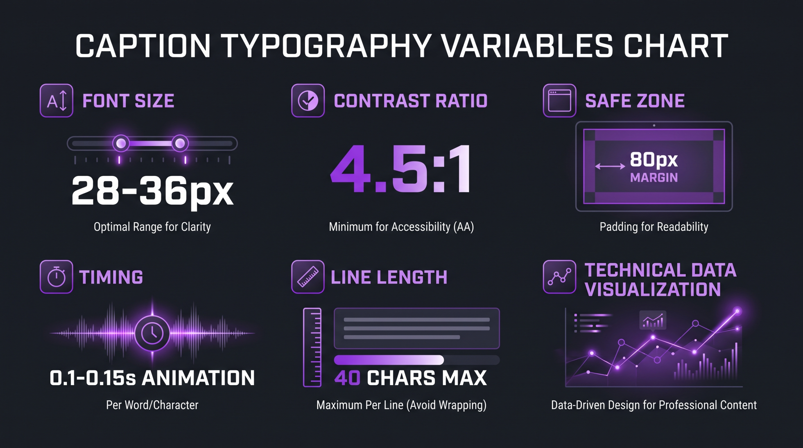
Key typography variables for caption design — sized for comprehension, positioned for platform safety zones
Mistakes That Kill Retention
The most common caption failures in professional video production are not creative failures — they are process failures. They happen when caption work is treated as a post-publish task, when auto-generated files are used without human review, or when caption decisions are made on a desktop monitor without checking them on the primary viewing device. Here are the five most reliably damaging mistakes.
1. Timing Drift Left Uncorrected
Auto-generated caption files — from YouTube’s automatic captions, from Whisper-based transcription tools, or from any AI transcription service — require human review and timing correction before they are ready for a quality production. AI transcription accuracy has improved significantly, but timing precision on emotional beats, fast speech, and technical vocabulary remains inconsistent. A caption that appears 0.4 seconds after the spoken word creates a ratchet effect: the viewer reads the next word before it appears, then waits, then feels the lag compound over time. Many viewers do not consciously identify this as a caption problem — they just feel the video is somehow off, and they leave.
2. Line Length Overload
When a caption block contains more than about 40 characters per line, reading speed slows. The eye has to travel further across the frame, the return sweep back to the next line takes measurable time, and the caption may still be on screen when the speaker has moved on — creating a lag in attention between audio and text. The instinct to minimize the number of caption events by cramming more text into each block saves production time and costs retention. Break long sentences at natural phrase boundaries and allow the caption duration to reflect the reading time of the block, not just the speaking time.
3. Low Contrast on Variable Backgrounds
White text without a background, stroke, or shadow works on dark footage and fails on bright footage. If your video includes outdoor shots, product shots against white backgrounds, or any bright scene composition, white-only open captions will become unreadable at exactly the moment a new scene appears. The fix is always the same: add a semi-transparent black background behind the text (typically 60–70% opacity on a black fill), add a 2–3px text stroke in a contrasting color, or add a drop shadow with a radius of 3–5px. Any one of these, applied consistently, eliminates the problem across all shot types.
4. Ignoring Platform UI Overlaps
Each platform’s player interface occupies specific regions of the frame. On TikTok, the right-side action column (likes, comments, shares, follow) covers approximately 15–18% of the right edge of a vertical video. On YouTube, end-screen elements cover the bottom-right quadrant during the final 20 seconds of a video. Instagram Stories shows the viewer count and activity at the top and the reply bar at the bottom. Captions placed in any of these UI zones will be partially or fully obscured on the majority of viewers’ devices. The design decision made on a desktop editing timeline does not reflect what viewers actually see on a phone in portrait mode.
5. Treating Captions as a Post-Edit Upload
The most structurally damaging mistake is treating captions as something that happens after the edit is picture-locked. When captions are added after the fact, the editor cannot account for how long each caption block needs to be on screen for comfortable reading. Fast-talking speakers who fill every frame with words produce caption events that are too short to read. Scenes cut to music where the editor prioritized audio sync produce caption timing that conflicts with cut points. When caption strategy is part of the edit brief — when the editor knows that this video will use word-by-word kinetic captions on TikTok — pacing decisions in the edit itself can support the caption reading experience rather than fight it.
💡 Pro Tip: Before finalizing any caption treatment, export a 720p preview and watch it on your phone at normal viewing distance with sound off. The editing monitor will not tell you what your audience experiences. The phone will.
A Workflow for Testing Caption Styles
Caption optimization is empirical. Instinct about which style “feels better” is a starting hypothesis, not a conclusion. Viewer behavior data — average view duration, drop-off maps, replay rates — tells you whether the hypothesis is true for your specific audience on your specific platform. The following workflow is designed to produce interpretable results from a small number of tests without requiring a statistically sophisticated experimental setup.
Step 1: Isolate One Variable
The fundamental rule of caption testing is the same as any controlled experiment: change one thing at a time. Comparing word-by-word kinetic captions against full-line subtitles on two different videos tells you nothing, because the videos themselves are different variables. The correct test is to take the same piece of footage and produce two exports — identical in every way except the caption style. This requires that you keep project files for previous uploads or plan tests during production rather than retrofitting them.
Good first-test variables: style family (kinetic vs. full-line), text size (standard vs. 20% larger), caption position (lower-center vs. center-frame), and presence vs. absence of a semi-transparent background strip. Each of these is a single, clean change that produces interpretable data.
Step 2: Choose a Comparable Clip
Select a clip that is representative of your typical output — similar length, similar topic, similar opening hook strength. Clips with unusually strong or weak hooks will skew results because hook quality dominates early retention and will mask caption effects. A clip in the 60–90 second range gives enough duration to see caption effects in the mid-video retention curve while keeping production of two versions manageable.
If possible, use a clip that previously performed near your channel average — not your best-performing clip (ceiling effect) or your worst (floor effect).
Step 3: Publish and Measure
Publish both versions within the same 48-hour window to control for day-of-week and algorithm distribution effects. On YouTube, average view duration percentage and the audience retention graph are the primary metrics to compare — look specifically at the 25%, 50%, and 75% checkpoints and at the shape of the curve (is it gradual and consistent, or are there specific drop-off spikes?). On TikTok, average watch time and the “watched full video” percentage are the most useful signals. On LinkedIn, video completions and the first 30 seconds retained are the primary indicators.
Allow at least five days after publishing before drawing conclusions. Early views are often from your most engaged subscribers (whose behavior skews high) and the broader audience distribution takes several days to stabilize.
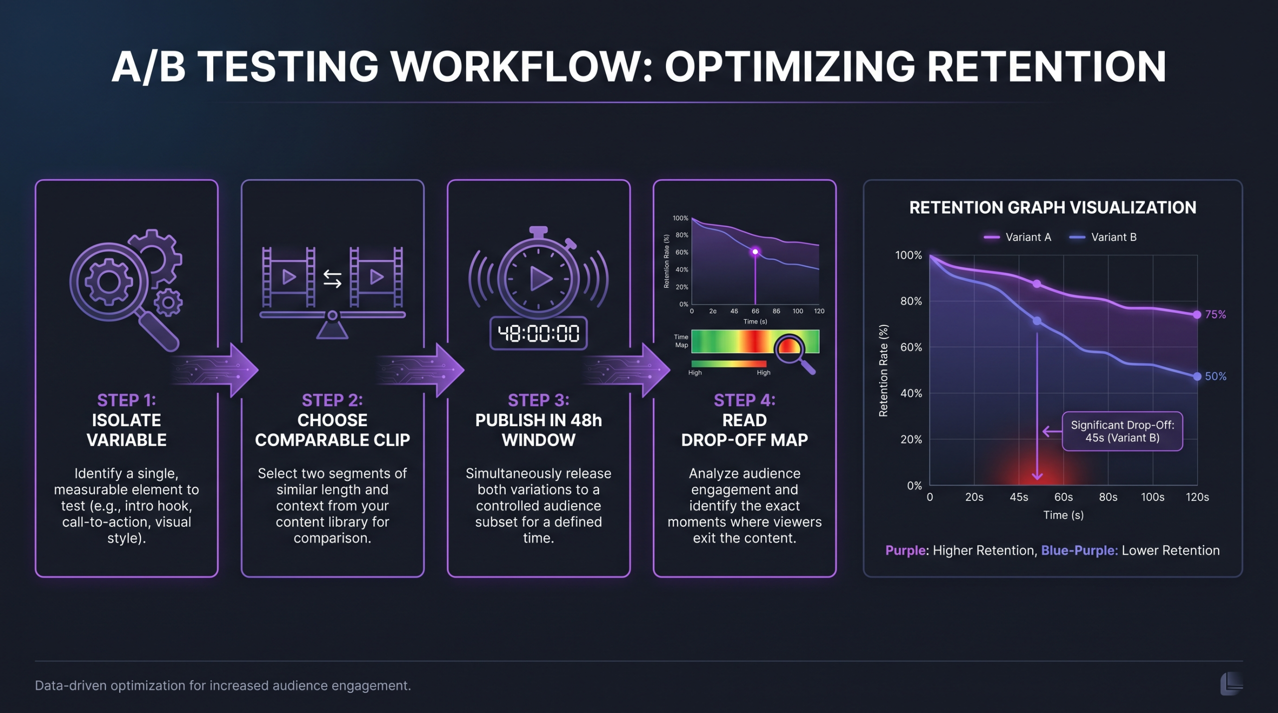
A structured four-step caption test cycle for generating interpretable retention data
Step 4: Read the Drop-Off Map
The retention graph is not just a summary metric — it is a diagnostic tool. If caption Version A shows a sharp drop-off at the 15-second mark that Version B does not, there is likely something happening at that moment — a difficult caption block, a timing drift episode, a placement that conflicts with a UI element — that is driving viewers away. Go back to the timeline, find what happens in the video at that 15-second mark, and inspect the caption treatment specifically. This kind of targeted diagnosis is more useful than aggregate average view duration comparisons.
Working with Your Editor on Caption Strategy
Caption strategy works best when it is agreed upon before the edit begins, not negotiated after delivery. A video editor who knows that the final output will use word-by-word kinetic captions on TikTok will make different pacing decisions than one who adds captions as a final upload step. The brief should specify: the caption style family, the target platform and its specific UI constraints, the font and size decisions (or at minimum, the brand guidelines that govern them), and the timing precision expected from the caption layer.
For brands producing at scale — regular series, multi-platform repurposing, or high-volume social output — caption templates pay for themselves quickly. A set of After Effects or CapCut templates with pre-built caption styles, correctly sized and positioned for each platform format, eliminates the per-video decision-making overhead and ensures consistency across a content library. This is an area where investing upfront in a defined caption system reduces both production time and the frequency of caption-related mistakes.
Understanding what video post-production actually involves — and where caption work sits in that workflow — helps brands set realistic timelines. Caption work done well takes time: transcription, timing review, style application, and platform-specific QC. When it is scoped correctly and budgeted for, it produces a meaningfully better viewer experience. When it is squeezed into the end of a production cycle as an afterthought, it almost always shows.
Teams working with a video editing agency should include caption strategy in the creative brief alongside color grade, music, and pacing direction. The caption layer is part of the viewing experience — it deserves the same attention as any other editorial decision. At Increditors, caption treatment is included in the edit brief process rather than handled as a separate upload step, which means the pacing of the edit, the timing of the cut points, and the caption positioning are designed as a unified viewing experience from the start. For more on how production budgets factor into the overall editing investment, see our guide on professional video editing costs.
For brands producing content for global audiences, caption strategy intersects with localization strategy. The style decisions made for English-language captions may need adaptation for right-to-left languages or for languages with significantly longer average word length (German, Finnish) that change how line breaks need to be structured. If you are planning a localization rollout, establishing caption style standards at the source-language level — and documenting them clearly — makes the adaptation process significantly more efficient. The costs of video localization are directly affected by how well-structured the source captions are.
As AI-assisted caption tools improve, the production cost of generating accurate timed transcripts continues to fall. What does not become cheaper or easier to automate is the design and strategic judgment layer: which style matches this content, this platform, this audience, and this brand? That judgment remains human work — and it remains the difference between captions that are present and captions that actively support retention.
Tools like Rev and Descript have improved the speed of high-accuracy transcription with timestamps, reducing the manual timing correction burden substantially. Even with AI-generated timing, a human review pass for alignment, line-break decisions, and style application remains necessary for production-quality output. The tools handle transcription; the craft decisions remain with the editor and the creative lead.
FAQ
What caption style works best on YouTube?
For most YouTube long-form content, full-line subtitle blocks are the reliable default — they are universally understood, readable on all devices, and compatible with YouTube’s native caption system for SEO indexing. For educational content where key terms matter, highlight-word animated captions can improve comprehension and time-on-page. For YouTube Shorts, word-by-word kinetic captions perform well because they match the energy expectations of short-form viewers. The right choice depends on the content length, pace, and the degree to which you want the caption layer to signal energy versus clarity.
Do word-by-word captions actually improve retention?
Industry practitioners broadly report that kinetic captions tend to produce stronger early retention on short-form platforms — the motion creates a visual anchor that keeps the eye on the video. However, the effect is context-dependent: kinetic captions on content with complex or technical language can actually hurt retention by removing the context window that readers rely on for comprehension. The honest answer is that the performance difference between styles is content-specific, and any team making this decision should test it on their own content rather than relying on generalizations from other channels or content categories.
How long should each caption line be?
A practical ceiling of 40 characters per line covers the majority of reading-speed scenarios without requiring viewers to scan too wide. For vertical video (9:16), the effective readable width is narrower, so 35 characters is a safer ceiling. Break lines at natural linguistic phrase boundaries — not arbitrary character counts — so the semantic grouping of the words supports comprehension. “The conversion rate / increased significantly” reads faster than “The conversion rate increased / significantly” because the first break respects the verb phrase boundary.
Should I use platform auto-captions or custom ones?
Platform auto-captions (YouTube’s automatic captions, TikTok’s auto-captions) have improved substantially in accuracy but should not be used as-is for production content. They lack style control, timing precision, and line-break intelligence. They are also not burned into the video — viewers can turn them off, which means silent viewers who have not enabled captions will not see them at all. For any content where the caption layer is part of the viewing experience, open (burned-in) captions produced to spec are the correct approach. Platform auto-captions are a discovery and indexing asset — useful for search, but not sufficient as a viewer experience decision.
How do caption styles differ for B2B vs. B2C video?
B2C content, especially on consumer social platforms, supports a wider range of caption expressiveness — emoji-enhanced captions, bold kinetic styles, and playful treatments are native to the environments where B2C content performs. B2B content, particularly on LinkedIn and YouTube, rewards clarity and professionalism over energy signaling. For B2B, full-line subtitle blocks with clean sans-serif fonts, highlight-word animation for key terms, and branded graphic captions for premium productions are the appropriate range. Emoji-enhanced or overly casual kinetic treatments in a B2B context signal low production intent, which undercuts the authority positioning that B2B content typically needs to build trust with buying committees and decision-makers.
Verdict
Caption style decisions are not aesthetic preferences — they are functional choices that affect comprehension, retention, and brand perception. The six style families covered here — word-by-word kinetic, full-line subtitle, speaker-labeled, branded graphic, emoji-enhanced, and highlight-word animated — each have a specific set of contexts where they outperform the alternatives. Getting the match right means understanding both the content format and the platform environment, not just following whatever style is trending.
The typographic variables — font weight, size, contrast, position, and animation timing — are the implementation layer that determines whether a theoretically correct style choice actually performs in practice. A word-by-word kinetic style applied with 0.5-second timing drift and 18px text on a bright background will underperform a properly executed full-line subtitle in nearly every scenario. The style family is the direction; the execution is the delivery.
Testing one variable at a time against real retention data is the only reliable way to know what works for your specific audience on your specific platform. The testing workflow in this guide — isolate one variable, use a representative clip, publish in the same window, read the drop-off map — is designed to produce interpretable results without requiring a statistically complex setup. Start with one test, build a baseline, and iterate from evidence rather than from instinct.
Most importantly: caption strategy belongs in the edit brief, not in the upload checklist. When caption decisions are made alongside color, pacing, and music — not after picture lock — the entire viewing experience coheres. That coherence is what separates video that viewers finish from video they abandon at the 30-second mark.
Ready for Video That Actually Converts?
Tell us about your project and we will put together a custom plan.