








![3D Explainer Video - ScribbleLive.mp4_snapshot_00.12_[2022.03.09_03.14.16]](https://increditors.com/wp-content/uploads/elementor/thumbs/3D-Explainer-Video-ScribbleLive.mp4_snapshot_00.12_2022.03.09_03.14.16-r7wb53mx72rxst3qcqyrfxdmeyzb5r9jbl0wbjujh4.png "3D Explainer Video – ScribbleLive.mp4_snapshot_00.12_[2022.03.09_03.14.16]")
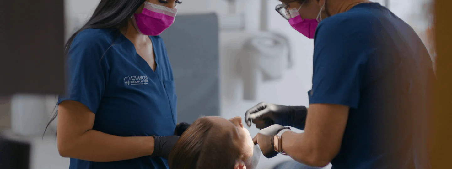
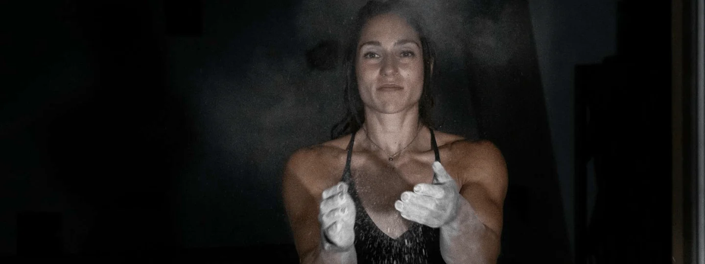

























Color correction fixes technical problems — exposure, white balance, noise — so every shot looks like it was filmed under the same conditions. Color grading then applies a creative look, mood, or cinematic style on top of that corrected baseline. Every professional video needs both, in that order. Skipping correction and jumping straight to grading produces inconsistent results that no grade can fully rescue.
- What Is Color Correction?
- What Is Color Grading?
- The Key Differences: A Side-by-Side Comparison
- The Correct Workflow: Correction Before Grading
- Tools, Scopes, and Software Used
- When You Need Both vs When Correction Alone Is Enough
- Common Mistakes Brands Make With Color
- Frequently Asked Questions
- Verdict
What Is Color Correction?
Color correction is the technical process of making footage look the way the camera should have captured it under ideal conditions. It is not about making video look stylish — it is about making it look accurate, consistent, and broadcast-ready before any creative layer is applied.
Every camera sensor has limitations. Lighting changes between shots, even during a single interview segment. Auto-white-balance shifts mid-clip. Highlights blow out. Shadows lose detail. Log or RAW footage — the formats professional cameras use to capture maximum data — looks flat and desaturated straight out of camera by design, because it is meant to be corrected, not used as-is.
Color correction addresses all of this. A colorist (or editor performing primary correction) works through a sequence of adjustments that typically includes:
Primary Correction Steps
Exposure and luminance balancing: Getting the overall brightness of every clip to match. A shot filmed in open shade looks 1.5–2 stops darker than the same subject filmed in direct sun. Correction brings both into a shared luminance range so cuts don’t jar the viewer.
White balance correction: Removing unwanted color casts. Indoor tungsten light pushes footage orange; overcast skies push it blue-green; mixed lighting (a window plus overhead fluorescents) creates an especially difficult split that has to be neutralized before grading. The goal is footage with neutral whites and accurate skin tones.
Contrast and gamma adjustment: Making sure shadows hold detail, highlights don’t clip, and the mid-tones are placed correctly for the viewing environment (web delivery, broadcast, cinema, or HDR). This often involves applying a LUT (Look-Up Table) to convert log footage into a usable viewing colorspace like Rec.709.
Shot matching: Once individual clips are corrected, the colorist compares them side-by-side and adjusts each until the sequence reads as a single, continuous scene rather than a patchwork of different lighting conditions. This is especially critical for multi-camera interviews, corporate event footage, and product videos shot over multiple days.
Noise reduction: High-ISO or underexposed footage carries luminance and chroma noise (grain-like digital artifacts). Color correction includes at least basic noise reduction to clean up footage before the grade amplifies any artifacts.
💡 Pro Tip: Color correction is measured against objective truth — waveform monitors, vectorscopes, and parade scopes replace guesswork with data. A colorist checks that skin tones hit the expected range on the vectorscope and that whites sit at a consistent IRE level on the waveform, not just that the image “looks right” on a particular monitor.
The end result of good color correction is footage that is technically neutral, internally consistent, and ready for creative treatment. Crucially, color correction alone does not produce a cinematic look, a warm intimate feel, or a cool high-fashion aesthetic — those come from color grading.
What Is Color Grading?
Color grading is the creative step that follows correction. Where correction makes footage accurate, grading makes it feel a certain way. It is the deliberate manipulation of color to convey emotion, reinforce brand identity, signal a time period, or match a visual reference.
Think of correction as fixing the foundation, and grading as choosing the paint, furniture, and lighting of the room. Both matter; they serve completely different purposes.
What Color Grading Actually Changes
Hue, saturation, and luminance (HSL) targeting: A colorist can select a specific color range — say, the greens in a background — and shift them toward teal, desaturate them to near-grey, or darken them independently of everything else in the frame. This creates the selective color relationship that distinguishes premium-looking video from flat, ungraded footage.
Creative LUTs and power grades: Grading often starts with a creative LUT — a mathematical transformation that maps the corrected image onto a predefined look. Cinematic teal-and-orange, desaturated thriller grey, warm golden-hour nostalgia, clean bright SaaS-demo white — all of these begin with a LUT applied to a properly corrected base. A LUT applied to uncorrected, inconsistent footage will look different on every shot.
Shadows, midtones, and highlights lifted or shifted independently: The split-toning technique — warming shadows toward amber while cooling highlights toward blue — is a signature of the contemporary cinematic grade. It is purely creative, with no basis in camera accuracy, and it is achieved by manipulating the three-way color wheels or curves in the shadows and highlights separately.
Contrast sculpting: Beyond technical contrast correction, grading pushes contrast as a storytelling tool — crushing blacks for a gritty feel, lifting shadows for an airy high-key brand look, or adding a subtle S-curve for depth without making shadows muddy.
Secondary adjustments and masks: Advanced grading uses Power Windows (shape-based masks), tracking mattes, and secondary color qualification to treat specific zones of the frame differently. A colorist might subtly brighten the subject’s face using a tracked oval mask while keeping the background darker — a technique called dodging and burning in the color grading context. This is invisible to the viewer but creates a sense of depth and draws attention to what matters.
Brand-consistent looks: For commercial and marketing content, color grading is often tied to a brand’s visual identity. A fintech brand might specify cool, clean, slightly desaturated tones; a wellness brand might want warm, soft, golden tones; a fashion label might push for high contrast with shifted hues. A professional colorist translates these brand briefs into specific node trees or look files that can be consistently applied across a campaign.
💡 Pro Tip: The most powerful creative grades are nearly invisible to a casual viewer — they shape the emotional response without announcing themselves. If a viewer notices the grade before noticing the subject or message, the grade is too aggressive. The exception is when a stylized look is itself part of the brand or concept (e.g., a split-tone product video with a very intentional aesthetic).
The Key Differences: A Side-by-Side Comparison
The fastest way to understand the distinction is to compare them across every practical dimension:
One important clarification: the word “grading” is often used loosely in the industry to mean the entire color pipeline — both correction and creative grading combined. When a client says “we need color grading,” they almost certainly mean both steps. When a colorist says they are doing “primary correction,” they mean only the technical step. The confusion is common; the distinction matters when you are scoping work and setting expectations.
The Correct Workflow: Correction Before Grading
The order matters — and it matters a lot. Here is the professional color pipeline from raw footage to final delivery, as practiced in tools like DaVinci Resolve, Premiere Pro, and Final Cut Pro:
Stage 1: Conform and Organize
All footage for a project is imported and the timeline from the edit is conformed (linked) in the color tool. At this stage the colorist reviews what they are working with: camera formats, log profiles, ISO ranges used, any problematic clips (blown highlights, extreme underexposure, mixed lighting scenes). This is diagnostic work before any node is created.
Stage 2: Color Space Transform (CST)
Log or RAW footage needs to be converted from its native color space (S-Log3, BRAW, Canon Log 3, etc.) to a working color space — typically DaVinci Wide Gamut or ACEScct — and then to a viewing LUT for monitoring. This Color Space Transform is the first node in the grade and makes flat log footage look like normal video for the rest of the correction process. Without it, every correction reference would be working on a skewed image.
Stage 3: Primary Correction
With the CST in place, the colorist begins primary correction: exposure, white balance, and contrast for every clip. Scopes are used at every step — the waveform shows luminance distribution, the vectorscope shows color bias, the parade scope shows RGB channel balance. A skin tone memory marker on the vectorscope is a practical shortcut: skin tones across ethnicities cluster in a narrow diagonal range, and placing them correctly often resolves most white balance issues simultaneously.
Stage 4: Shot Matching
After individual clip correction, the colorist does a pass comparing consecutive shots in context. DaVinci Resolve’s Gallery and the “Match” function (using reference stills) automate the starting point, but the human review is essential. A shot that looks good in isolation may still feel slightly warm or dark when cut against its neighbor. Shot matching is iterative.
Stage 5: Creative Grade
Only after the timeline is fully corrected and matched does the creative grade begin. The colorist applies a grade — either starting from a creative LUT or building from scratch using curves, color wheels, and HSL qualifiers — that delivers the desired aesthetic. This is often done on a Group Pre-Clip or the equivalent so that the grade applies consistently across all clips simultaneously, with per-clip corrections still preserved underneath it.
Stage 6: Secondary Work
For high-budget projects, secondary color work — tracked Power Windows, skin tone refinement, sky replacement color matching, selective object desaturation — happens in this stage. This is where a colorist spends significant time on individual clips that have challenging conditions or that need visual effects integration.
Stage 7: Output and Delivery
The final stage converts from the working color space to delivery specifications: Rec.709 for web and broadcast, DCI-P3 for cinema, or HDR (HLG or PQ) for HDR delivery. Each delivery spec needs its own output LUT and a final check that highlights and shadows are within spec. Adobe Premiere Pro and Final Cut Pro handle basic color pipelines, but professional colorists overwhelmingly use DaVinci Resolve for its scope integration, node-based workflow, and industry-standard collaboration features.
When you hire a video editing agency for your commercial, brand film, or marketing content, this is the full pipeline they run on your behalf — not just “applying a filter.”
Tools, Scopes, and Software Used
Understanding the toolset separates informed clients from uninformed ones — and it directly affects how you evaluate quotes, review work-in-progress, and give useful feedback to your colorist.
The Essential Scopes
Software Landscape
DaVinci Resolve (Blackmagic Design) is the industry standard for dedicated color work. Its node-based workflow, integrated scopes, built-in noise reduction, and collaboration features make it the tool of choice for professional colorists. The free version handles the vast majority of color work; DaVinci Resolve Studio adds hardware-accelerated noise reduction, 3D stereoscopic tools, and additional collaboration features.
Adobe Premiere Pro handles color via Lumetri Color, which is accessible and capable for editors doing their own primary correction, but lacks the depth of node-based workflows for complex secondary work. Most professional colorists round-trip from Premiere to Resolve for final color.
Apple Final Cut Pro includes color tools that cover basic correction and some grading functionality. Its magnetic timeline integration makes it efficient for editors who are doing their own color on projects that don’t require dedicated colorist time.
Baselight (FilmLight) and Nucoda are high-end finishing systems used primarily in feature film and broadcast post-production, offering HDR mastering and very advanced color management at significant cost. Most marketing and branded content never requires these.
For brand and marketing video, the relevant question is not which software — it is whether your editing partner has a dedicated colorist or relies on editors doing basic Lumetri adjustments. The difference shows in the final image.
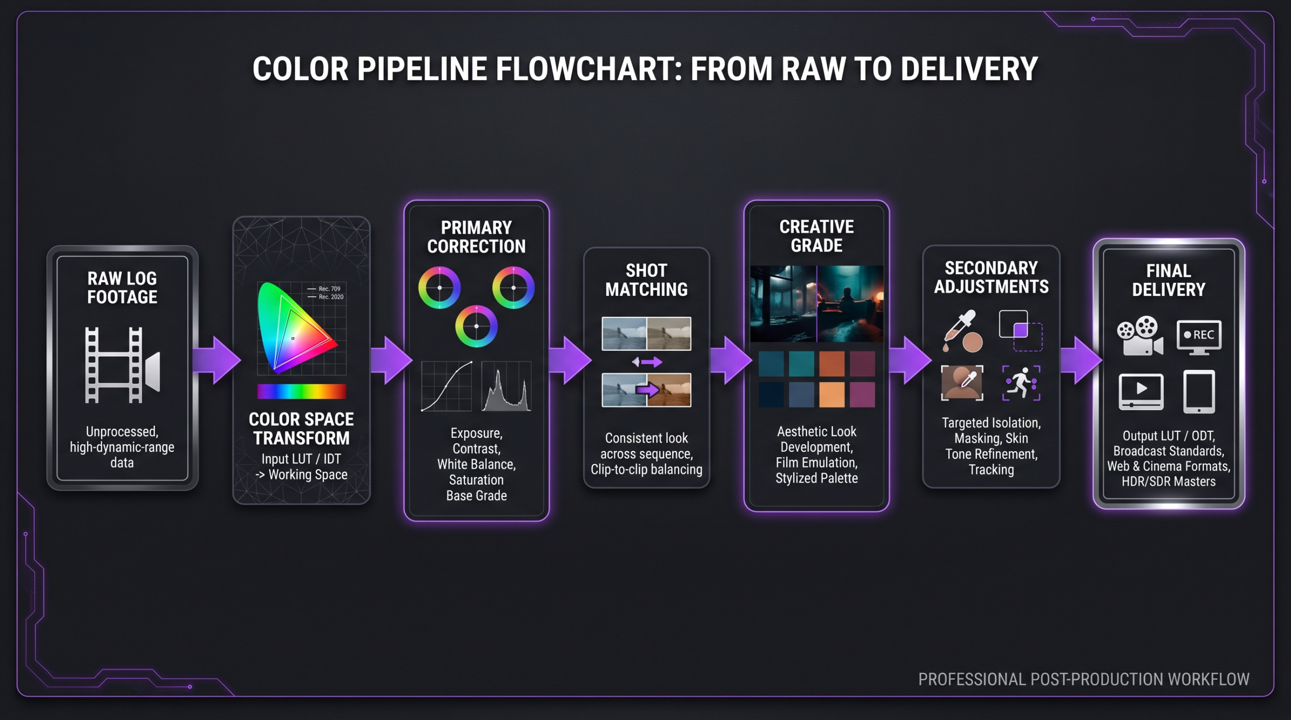
The color pipeline: correction establishes the baseline; grading applies the creative look.
When You Need Both vs When Correction Alone Is Enough
Not every video project requires a full creative grade. Understanding which scenario applies to your content helps you scope work accurately and avoid paying for a level of color complexity your project does not need — or skimping on color for content that absolutely requires it.
Correction Only (No Creative Grade)
Some video formats are functional rather than cinematic — the goal is accuracy, clarity, and consistency, not a distinctive visual style. Correction-only is typically sufficient for:
- Internal corporate training videos — accuracy and clarity matter; a specific look does not.
- Webinars and recorded presentations — correction ensures the speaker looks natural and lighting is balanced.
- Functional explainer videos — screen recordings with talking heads need balanced exposure and neutral color, not a cinematic grade.
- Legal or compliance content — accuracy, not aesthetics, is the objective.
Both Correction and Grading (Full Color Pipeline)
Any content where brand presentation, emotional resonance, or production value signals premium quality needs both steps:
- Brand hero films and TV commercials — the grade is the brand. Inconsistency between the ad and the brand’s visual identity erodes recognition.
- Product launch and demo videos — accurate, appealing product color is critical; the creative grade reinforces the product’s positioning (premium, accessible, technical, etc.).
- Social media content series — a consistent grade across a series creates visual coherence that audiences associate with professional production quality.
- YouTube long-form content — channels that use a consistent look build a visual identity that reinforces brand recognition in feeds.
- Case study and testimonial videos — a warm, credible look makes the subject feel more trustworthy; a cold or flat grade undermines the emotional intent.
- Cinema, documentary, and narrative work — grading is a core storytelling tool, not optional.
If you are wondering about the cost implications of adding a full color grade to your project budget, the color grading cost breakdown covers per-video and per-minute market rates in detail. For a broader look at what professional post-production costs at different budget tiers, the professional video editing cost guide is the most comprehensive reference on the site.
Common Mistakes Brands Make With Color
After reviewing thousands of hours of brand and marketing content, the same errors appear repeatedly. Here are the most common — and why they matter more than most marketing teams realize.
1. Grading Before Correcting
Applying a creative LUT to log footage, or to footage with inconsistent white balance, is the single most common color error in DIY and lower-budget video production. The LUT behaves differently on every clip because the starting point is different for every clip. The result looks inconsistent even if the LUT itself is high quality. Correction first, grade second — always.
2. Calibrating for One Monitor
A grade that looks perfect on an uncalibrated consumer monitor often looks different on a calibrated reference display — and very different on a phone screen, a TV in a bright room, or a projector. Professional colorists use calibrated reference monitors (or a properly profiled display verified with hardware colorimeters) and check output on multiple viewing conditions. Brands that approve color on a random laptop screen and then wonder why it looks different in other contexts are experiencing this problem.
3. Inconsistent Grade Across a Campaign
A brand that produces videos with different colorists, or at different times without a defined look document, ends up with a fragmented visual identity. The ads look warm; the website hero video looks cool; the social content looks desaturated. Viewers notice this even when they cannot articulate it — it signals inconsistency in the brand overall. The solution is a saved grade, a creative LUT, or a documented look reference that gets applied consistently across all content.
4. Over-Saturating Product Colors
It is tempting to push saturation to make products look vivid and appealing. But oversaturation produces colors that do not match the actual product — which creates customer expectation problems (especially in e-commerce) and feels manipulative rather than premium. The standard is: accurate product color, enhanced by a compelling but realistic grade.
5. Skipping Color for “Quick” Videos
Many brands apply proper color to their hero content and skip it entirely for social content, internal-use videos, or lower-budget cuts. The problem is that audiences now see all content in the same feed. A brand’s TikTok cut sitting next to its broadcast spot looks visually inconsistent — undermining the investment made in the hero content. At a minimum, primary correction should apply to all video that represents the brand publicly.
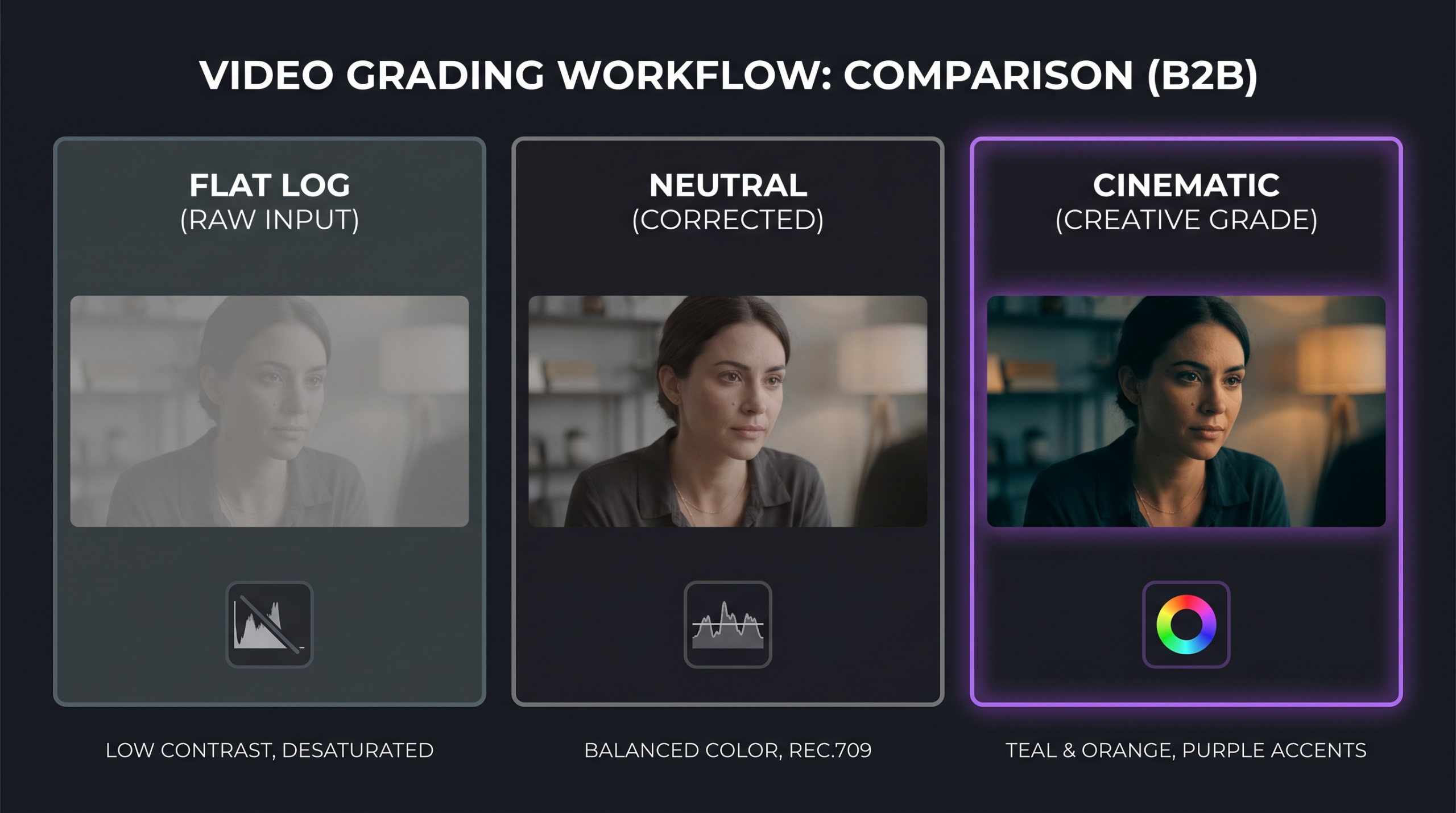
Left: uncorrected raw footage. Center: after primary correction. Right: final creative grade applied.
What Professional Color Work Actually Costs
According to industry benchmarks and published rate guides, professional color correction typically runs in the range of $50–$200 per minute of finished content for independent colorists, with full-service agencies bundling color into editing packages. Creative color grading — with a dedicated colorist, secondaries, and look development — adds complexity and cost on top of that baseline. These ranges shift significantly based on footage format (RAW and log take longer to correct than H.264), clip count, and delivery requirements (SDR vs HDR). For a full breakdown of what color grading specifically costs, including per-video and per-minute benchmarks by project type, see the dedicated color grading cost guide.
At Increditors, color is treated as a core production deliverable, not an afterthought. Senior editors with dedicated color expertise handle the correction pipeline, and brand-specific look development is available for clients who want a consistent visual identity across all content. For more on how we structure our editing workflow, the agency vs freelancer comparison outlines what you get — and what you give up — at each level of the market.
Frequently Asked Questions
Is color grading the same as color correction?
No. Color correction is the technical process of making footage look accurate and consistent. Color grading is the creative process of making corrected footage look a certain way — establishing a mood, aesthetic, or brand look. They are two distinct steps that work in sequence: correction always comes first.
Can you grade footage without correcting it first?
Technically yes, but the result is almost always worse. A creative grade applied to footage with inconsistent white balance or exposure will look different on every clip because the starting point varies. Correction establishes a consistent baseline so the grade behaves predictably across the entire project. Grading before correction is one of the most common reasons brand video looks “off” even when effort was put into the look.
What software do professional colorists use?
DaVinci Resolve is the industry standard for professional color work. It has the most comprehensive scope integration, node-based workflow, and collaboration features of any color application. Adobe Premiere Pro’s Lumetri Color and Apple Final Cut Pro are capable for editors doing their own color, but professional colorists working on brand and commercial content almost universally use DaVinci Resolve for the final color pipeline.
How long does color grading take per minute of video?
For basic correction on well-exposed H.264 footage, experienced colorists commonly work through 15–20 minutes of finished video per day. For complex projects with log/RAW footage, many camera angles, heavy secondary work, or HDR delivery, the rate drops considerably — industry practitioners often report 5–10 minutes of output per day for high-complexity work. These are rough industry benchmarks; actual time depends heavily on the footage, scope of work, and revision rounds. For cost implications, the color grading cost breakdown translates time into real budget ranges.
Do I need to brief a colorist differently than an editor?
Yes. Editors need a cut structure brief — story, pacing, music. Colorists need a look brief — reference images or film stills that communicate the intended mood, brand guide colors (especially if the color palette has specific hex values or Pantone references), and any technical requirements (delivery format, HDR vs SDR, legal range for broadcast). The more specific and visual your brief, the fewer revision rounds you will need. Showing a colorist three to five reference images is far more useful than describing a mood in words.
Verdict: Why the Distinction Matters for Your Video Strategy
Color correction and color grading are not interchangeable terms, even though the industry uses them loosely. They represent two different phases of a professional color pipeline that, when done in sequence by a skilled colorist, elevate video from technically competent to visually compelling.
For brands, the practical implications are clear:
- Every video that represents your brand publicly needs at minimum primary color correction. Without it, footage shot at different times or with different cameras looks inconsistent, and that inconsistency signals amateur production quality regardless of how good your message is.
- Brand, hero, and campaign content should have both correction and grading. The creative grade is how visual identity is built — it is the color equivalent of your brand’s typography and design system.
- Consistency matters more than any single grade. A moderate look applied consistently across all content builds stronger visual recognition than a stunning grade applied to one video and nothing else.
- Brief your color work visually, not verbally. Reference images communicate what words cannot, and they dramatically shorten the revision cycle.
The gap between footage that looks “fine” and footage that looks intentionally crafted is almost always a color gap. Understanding correction vs grading — and asking the right questions of your editing partner — is the first step toward closing it.
For more on how Increditors structures its full post-production pipeline for brands and agencies, the video editing services breakdown covers what professional editing tiers actually include — from assembly cuts through to color-finished delivery.
Ready for Video That Actually Converts?
Tell us about your project and we will put together a custom plan.